
This is the second part of a multipart interview with Richard Taylor who was the lead designer at Robert Abel & Associates, who were the original special effects team hired to produce the designs of the miniatures and special effects for Star Trek: The Motion Picture. The first part can be read here.
Part II

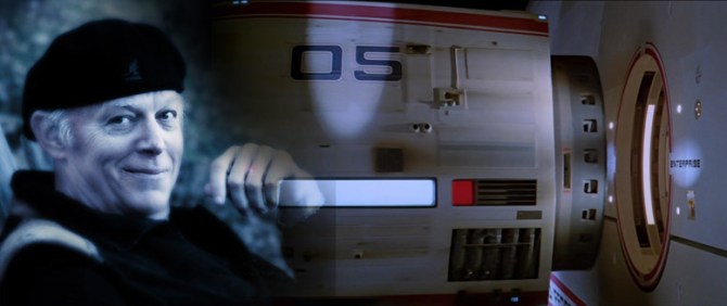
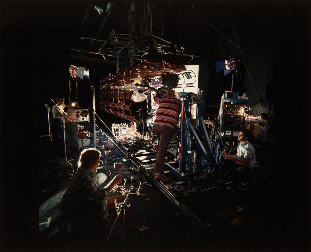
Model Review at Magicam in 1978.
Looking at an early version of the
docking port model detail
section of the Enterprise.
From left to right: Bruce Logan,
Richard Taylor, Gene Rodenberry,
Mike Lawler, Carey Melcher, unknown.
(Image: courtesy Richard Taylor)
Taylor: Yes, well you know my thoughts on the Enterprise which have been documented, when we initially got involved and I met Gene (Roddenberry) and had the first conceptual meetings and we reviewed everything that was underway for the television feature which of course included all the models; the dry dock, the space office complex and even V’ger which they were already working on, I had to review, and basically I said: “we’ve got to scrap it all.”
I mean it was just not of the design level of Star Wars or 2001 and so the design of the sets like the interior of the bridge, the hallways and corridors just weren’t of that quality, they were actually embarrassing.
So I basically said; look, we’ve got to start over for a variety of reasons. First we have to build the models with the technology that had been evolved for Star Wars. We would be using motion-control to make multiple exposures of the models for each light and to add motion-blur and to give the models scale we needed to build them larger.
You know it’s funny when you say we need to build large miniatures. Folks who aren’t actually into photographing models don’t realize that you cannot make a small thing look large. You need surface detail and depth-of-field to give them scale.
Gore: …and perspective, yeah.
Taylor: …yeah to give it scale. All of those details are essential.
Gore: I think the people at Weta Workshop that worked on Lord of the Rings said it best when they actually had a term for their models. They called them “bigatures” as opposed to “miniatures”. I think that really touches on what you are referring to.
Taylor: That’s exactly right. “Bigatures”.
I studied all the spacecraft that had been designed for science-fiction films. I really drilled down and talked to guys at JPL (Jet Propulsion Laboratory), I read everything I could find. I even had some actual astronauts consult. Basically I was really interested in how the technology for building structures in space had evolved.

Scene from Stanley Kubrick’s
2001: A Space Odyssey from 1968,
showing the Orion III spaceplane with
Pan Am livery, heading towards
Space Station V.
Obviously when Kubrick created 2001, he opened with that Pan Am ship arriving at the big circular space station that had artificial gravity from centrifugal force created by it’s rotation. So I brought all that into the design conversations I had with Gene Roddenberry.
But he had very specific things he just had to have me do. You know you can’t really argue with “the creator”. So Gene had some very specific things about the design of the Enterprise that he insisted upon.
The first and most important was the configuration, the shape of the ship, the saucer, the lower fuselage, the struts and the nacelles. That, he said, had to remain the same basic shape. I didn’t have to have tubular shapes for the nacelles and the struts didn’t have to be vertical, but it had to have that general configuration from the television show because the shape of the Enterprise was like a character that represented Star Trek.
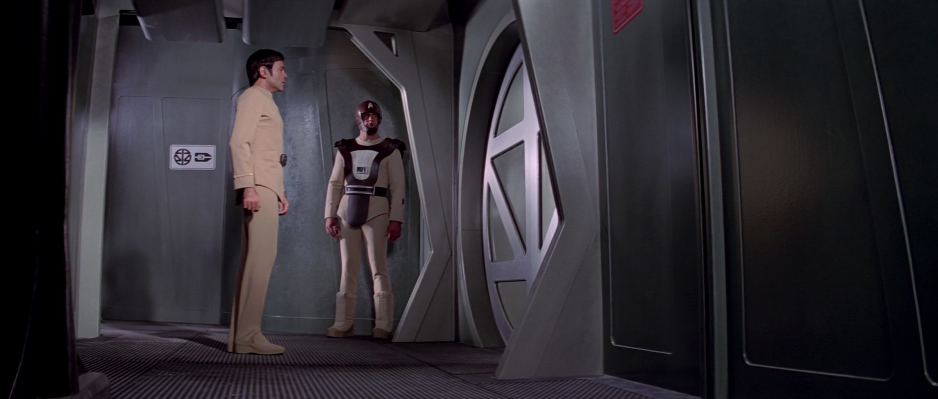
Scene from Star Trek: The Motion Picture
showing the interior oversize circular
doors for the docking ports
of various Starfleet craft.
When I originally met with Rodenberry I had started sketching some new designs for the Enterprise. And he said ‘no, no no, you have to keep that basic configuration.”
And then he started adding other details some of which I thought were crazy, but I had no choice but to try and incorporate them into the design.
The first one being that he wanted it to have twelve-foot in diameter circular doors.
Gore: Yeah that’s something I have heard you talk about in some of your other interviews. That’s one of the things that I found kind of interesting as a dug into this. I don’t now if this was something you intentionally snuck under-the-radar or something, but from all the things I’ve been able to work out in reverse engineering both the model and the actual set-piece is, that they actually ended up working out to be around seven and a half feet in diameter. I know you have mentioned that he wanted them at twelve feet, but at scale, they are little over seven and half feet.
Taylor: Yeah that’s right. He literally said ‘I want twelve foot in diameter circular doors’.
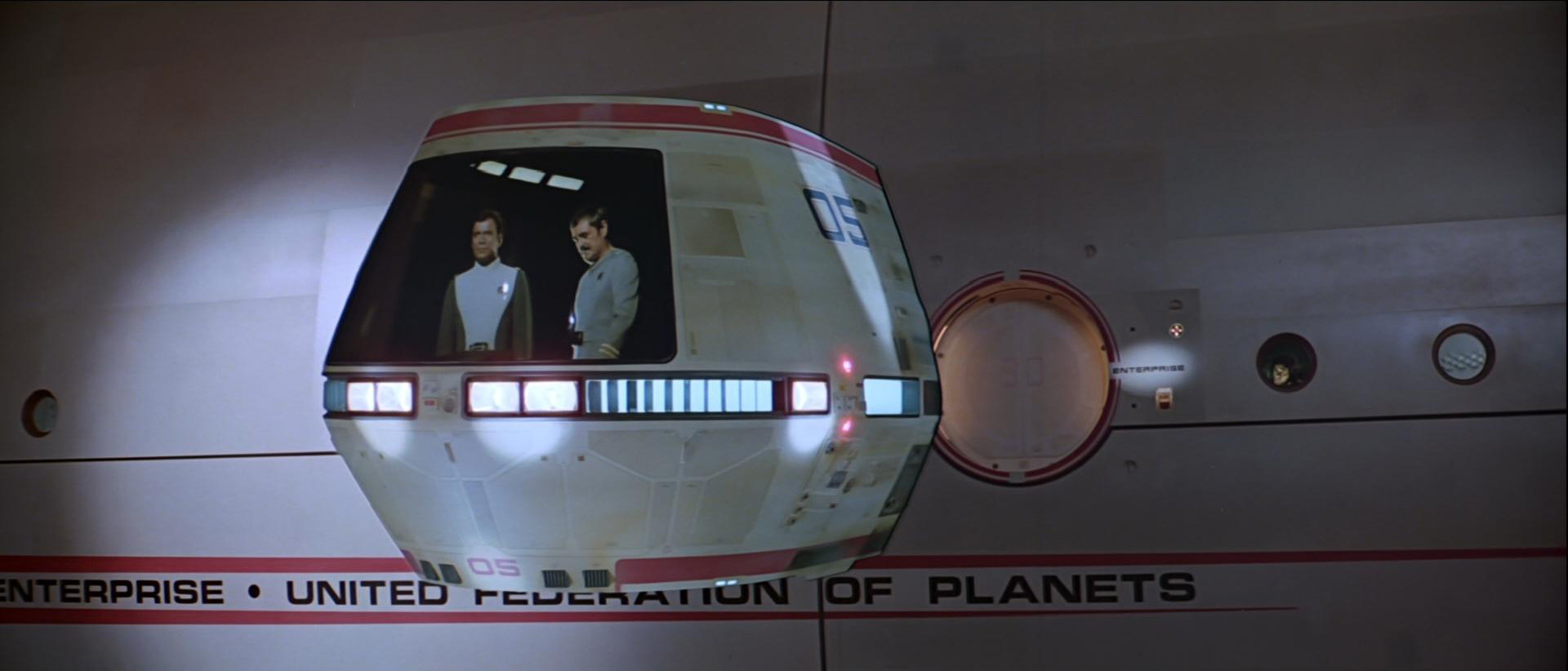
Scene from Star Trek: The Motion Picture,
showing the Travel Pod about to dock
with the Enterprise secondary hull.
And I said ‘well, wow… um… can they iris open?’
And he said ‘No, they can’t iris open!”
So I responded ‘well then how are we going to open the doors?’
So it ended up that they did get scaled down to seven or so feet because of all the entrants and exits through the doors during the film, For example the Guppy’s arrival and docking with the Enterprise.
Gore: The Travel Pod?
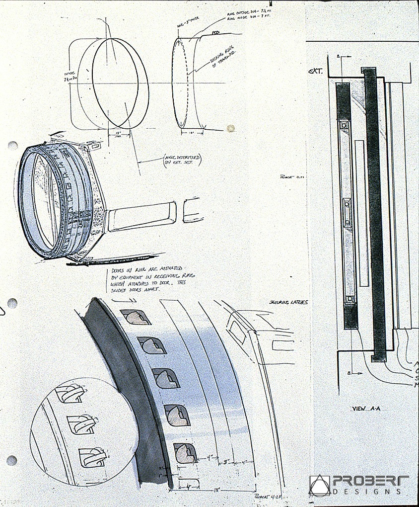
Production design sketch of the
Travel Pod docking ring and latch
mechanism by Andrew Probert.
(Image: Courtesy Probert Designs)
Taylor: Yeah the Travel Pod which had to dock with the Enterprise. You know I still think that is an incredibly silly looking model, that’s why I call it the Guppy. It had a configuration that was required to hit story points. It had a big window in front so you could see them (Kirk and Scotty) as they viewed the new refitted Enterprise. Putting the in the window images in was done with rear projection, the same way it was employed in Kubrick’s 2001.
But you know if that door had been twelve feet, that model would have been even more difficult. But to have a big circular door at the back of the thing, because it had to dock with the Enterprise, the same way the Vulcan shuttle had to dock with the bridge. Having those circular doors was a difficult thing to work into the their design.
And yes, they got scaled down and Rodenberry never said ‘Hey! Wait a minute! That’s not twelve feet!’
(both laugh)
Taylor: Going back to the Enterprise, and I have mentioned this in other interviews, but I’ll just bring it up again. As a designer, one tries to create things where form follows function.
Any object in weightlessness will spin around the center of it mass whether it’s a tin can or a spaceship.
Behind the scenes, filming of the Enterprise model in the orbital dry dock in 1979.
(Image: Virgil Mirano)
Well the Enterprise is an incredibly unbalanced object. It’s like a giant teeter-totter. And I believe the Enterprise‘s center of mass is outside of itself. It’s probably somewhere between the saucer and the nacelles. If you actually put the Enterprise into weightlessness and let it spin it would be interesting to see where it’s center of mass actually is. The Enterprise is a very unbalanced object.
And that was problematic when building the model itself because we had to armature it from five sides. When we had the armature in the back coming out through the cargo bay, just think about that model hanging out there. All of the torque on that thing, with the giant saucer and the rest of the model all extended out from that point it really was a challenge. So the armature and the structure of the model had to be super-strong.
Mounting it from the side was not a problem and mounting it from the front wasn’t a problem. But from the back as I said with the whole model extended out from that point was exceptionally heavy.
So the Enterprise is a really unbalanced object, and the practicality of it as a real object in space wasn’t thought out because it’s science fiction. So that’s what I finally just had to say “fine, OK , it’s science fiction.”
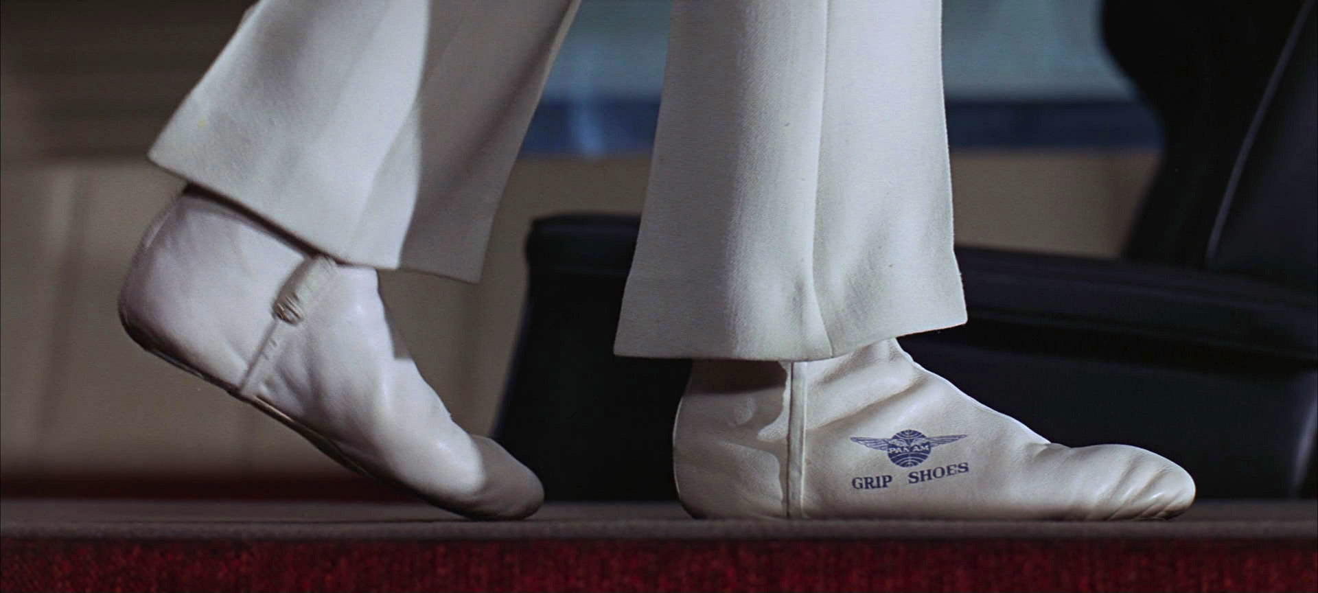
Scene from Stanley Kubrick’s
2001: A Space Odyssey,
of the Pan Am spaceplane’s in-flight
stewardess wearing “grip shoes”.
Any movie that I see where people are walking around with artificial gravity… that is scientifically impossible . . . it’s science fiction . . . so the laws of physics don’t apply.
Even in Ridley Scott’s latest picture Prometheus, or Passengers there is artificial gravity in the spacecraft. Just as in Aliens. In real film production . . . gravity costs a hell of a lot less than weightlessness. Kubrick dealt with it in 2001 with Velcro shoes, and centrifugal force and so forth. But 99% of outer-space films don’t deal with weightlessness because it’s crazy expensive to do practically. In CGI (computer-generated imagery) like Final Fantasy Spirits Within, it’s not a problem.
So the Enterprise is a science-fantasy spacecraft and the rules of physics don’t apply.
The fantail curvature underneath
the hanger deck in the secondary hull
of the Enterprise. (Third Wave Design)
For example the whole idea of how it propels itself, how it jumps to light-speed. The nacelles, and their anti-gravity matter and how they create a disturbance in space. That’s why I tried to make the nacelles have linear sidepieces that glowed and to make them look like giant magnets. Those massive magnets and the anti-matter in the nacelles would create a wake in space that the Enterprise would ride on …like a surfboard. So, that was the general concept I came up with as to how the Enterprise propelled itself into warp seed.
Nikola Tesla would have loved this. So that’s why at the back of the nacelles and the fuselage there are surfboard, skeg like shapes. Because it is, in a sense, “surfing” on the front of a wave.
Gore: That actually leads to one of the questions I had about the curvature under the fantail that ties into what you are referring to, which is “surfing along” as you term it, how was that curve determined and then fabricated?

A typical set of French curve
mechanical drawing tools.
Was that just a paper pattern or ellipse that was then applied to the turned or lathed cylinder that is the secondly hull to be cut out?
Or was it just “eyeballed” to what looked good when they were fabricating it?
Taylor: Well they matched the curvature to my side view orthographic drawing. And when I drew that side-view, I just tired to make it look cool. It wasn’t any curve based on any physics or anything. So it was arbitrary really.
Gore: Well it looks like it is about a 2.5 to 1 proportioned ellipse, or close to that. At least that’s what it looks like in the side-view drawings.
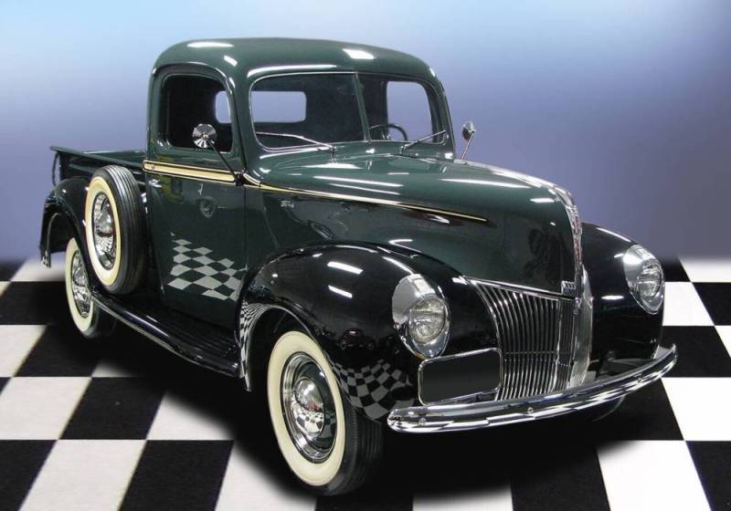
1940 Model 92A Ford Truck.
(both laugh)
Taylor: Well it was simply the curvature of one of my French curves that I thought looked good.
Gore: Ah ha! The truth finally comes out!
(both laugh)
Taylor: Yeah. Well one of the overall things I was trying to do with the Enterprise was to elongate it, to make it look more refined and elegant and not so boxy. So that’s why there where are all of those horizontal lines around the perimeter of the saucer. Even with the nacelles, with the linear magnets and so forth. All of that was trying to make this thing more elongated and more art deco, or art nouveau if you wish.
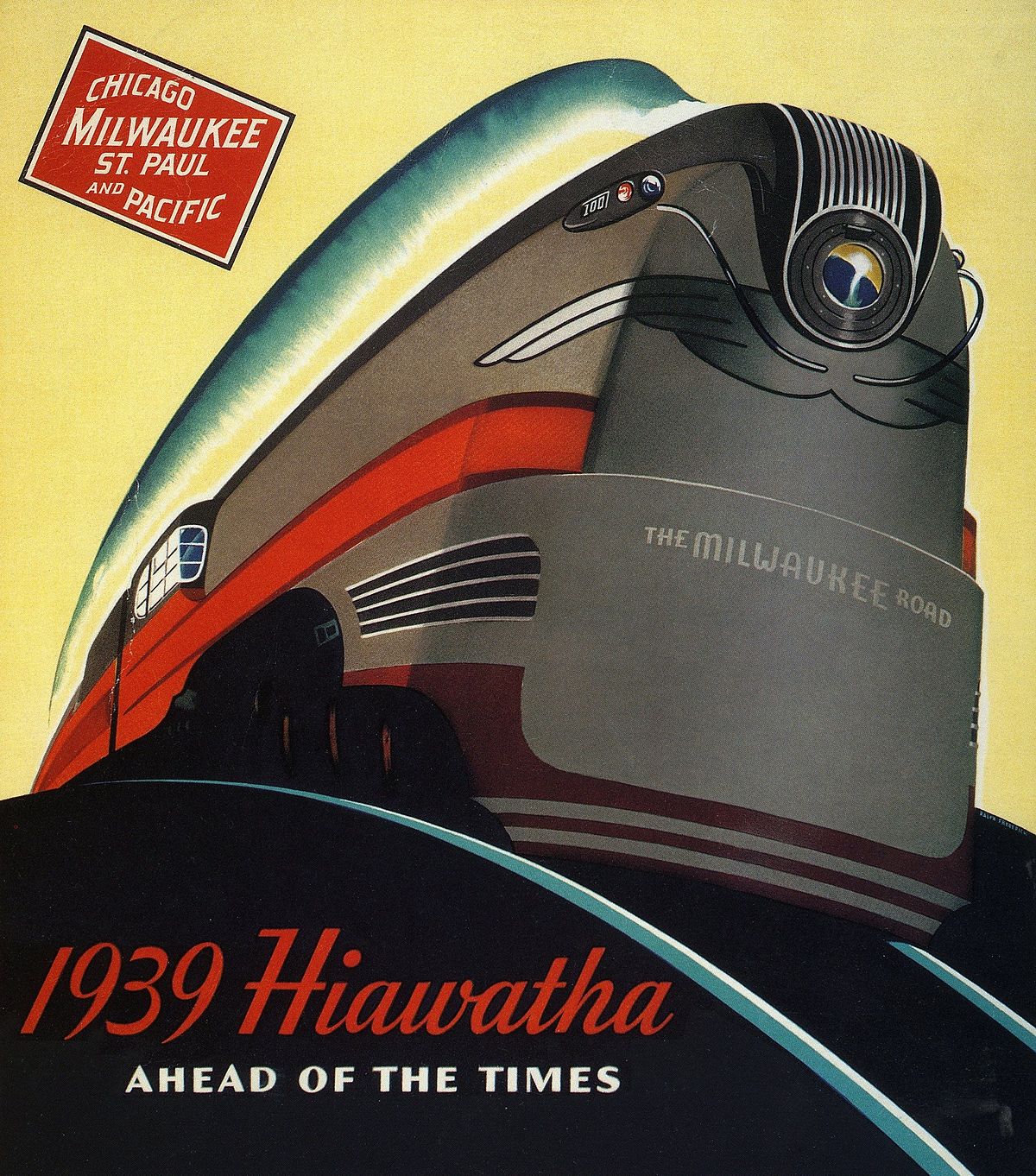
1939 advertising poster featuring the
art deco styled Milwaukee Road‘s
Hiawatha F7 steam locomotive.
For example the curvature of the saucer, if you look at those comparative drawings with the saucer from the television show, my saucer is much wider and the curvature from the bridge to the front of the saucer is much more elongated and elegant. Matt Jefferies had done that as well in his redesign. I wanted to make the ship seem bigger and more refined, more elegant, like an ocean liner.
Gore: Agreed.
Getting into the design of the nacelle themselves, I know you have mentioned in the past, you kept their design pretty much in your hands. In particular the horizontal and art deco styling, which is how you have referred to them in other interviews. Which I totally see and understand that visual reference. You have mentioned before that the front of the nacelles look almost like a 1940s Ford truck grill.
Taylor: That’s right!
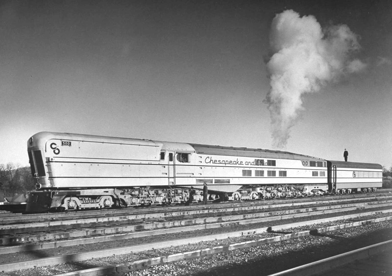
Chesapeake & Ohio M-1 class
locomotive from 1947.
Gore: And the overall shape that I think Jeffries had worked out for the Phase II ship design, which carried through to the yours, has almost a Hiawatha locomotive engine, as well as that of the C&O steam turbine engine, look from the 1940s in them. Where they have that forward, rounded-off, angled silhouette. Those are things I definitely pick up on and appreciate.
Taylor: That’s correct. If you look at the conceptual designs for diesel train engines during the 50s by Raymond Loewy and others you’ll see the influence.
Continue to Part III ›
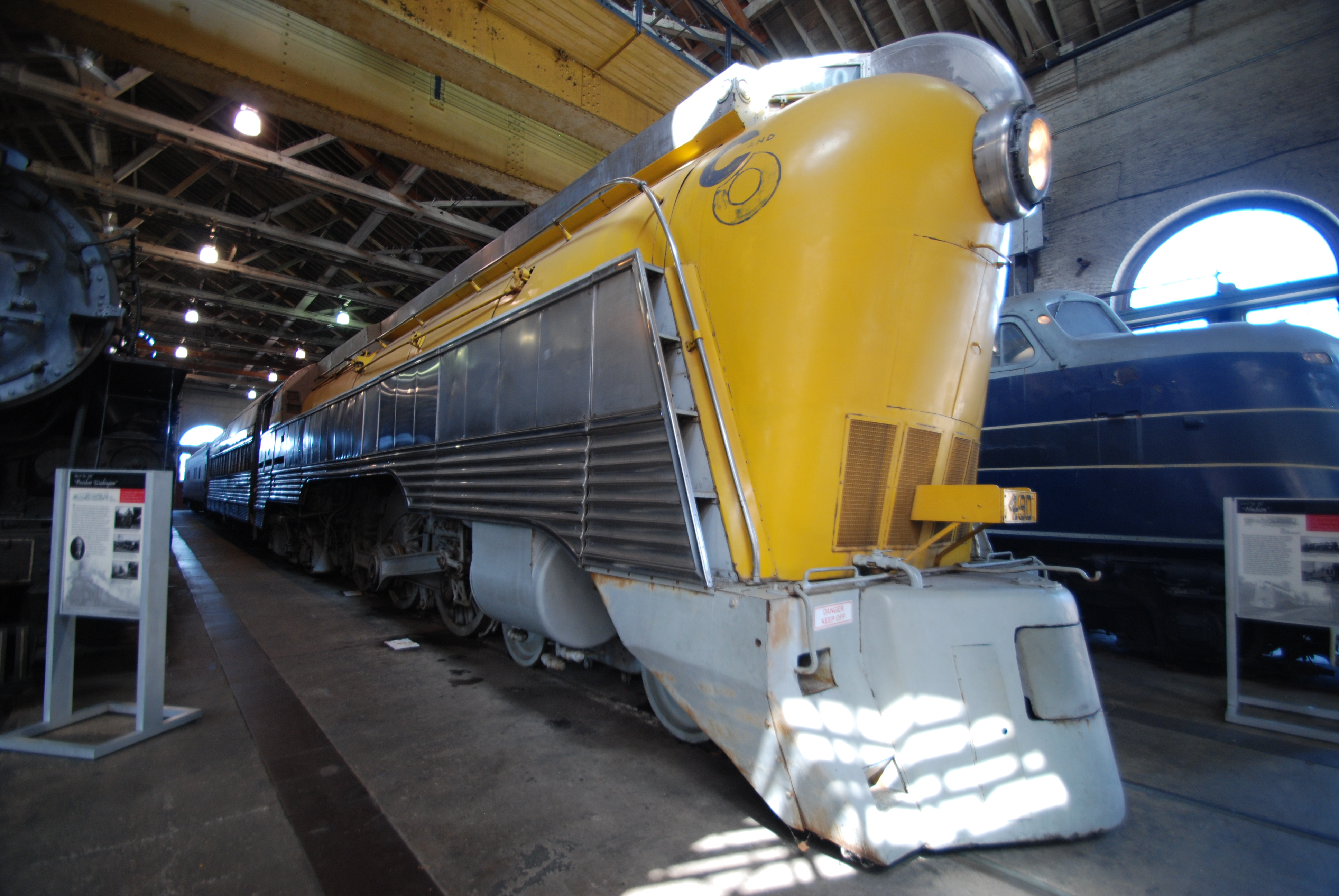
Chesapeake & Ohio No. 490
Hudson Streamline locomotive at
the Baltimore & Ohio Railroad Museum.

Pingback: Richard Taylor Interview (part I) | Third Wave Design
Pingback: Richard Taylor Interview (part III) | Third Wave Design
Pingback: Richard Taylor Interview (part IV) | Third Wave Design