
This is the final installment of a six part interview with Richard Taylor, the lead designer at Robert Abel & Associates, who were the original special effects team hired to produce the designs of the miniatures and special effects for Star Trek: The Motion Picture.

V’ger rear view 3D model and render by Steve Burg.
Part VI
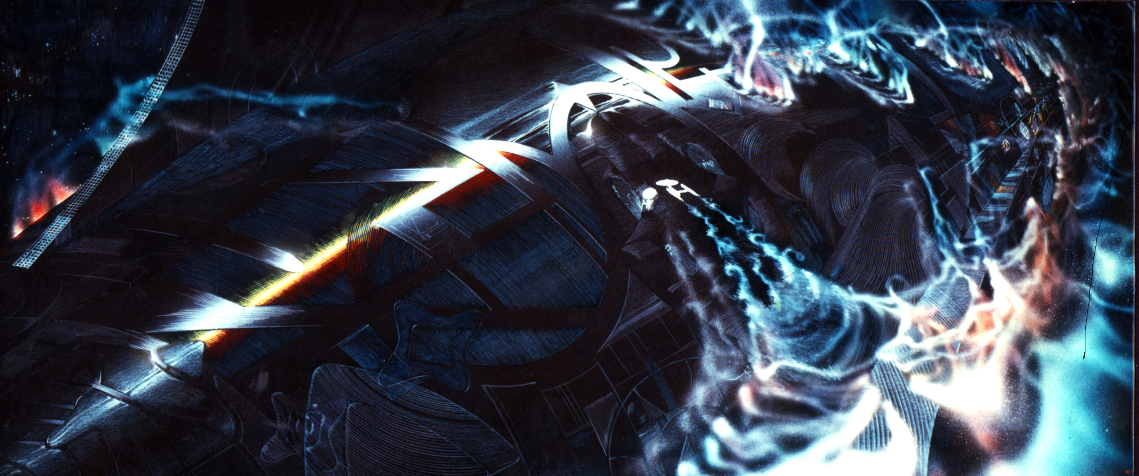
Concept illustration of the Enterprise flying
over V’ger causing it to react to its presence.
(Image: Courtesy Richard Taylor)
Taylor: You may have seen the illustrations of the Enterprise flying over the outside of V’ger.?
Gore: I believe so.
Taylor: Well there is a kind of metallic vapor cloud over the surface of V’ger that was going to interact with the Enterprise as it moved along.
Gore: I have seen some illustrations where it looked like eyeballs and things that were watching as the Enterprise flew by.
Taylor: Right. I’ll send you some of those things.
Basically as the Enterprise flew over the surface of V’ger the surface would react to the presence of the Enterprise. Similar to the way a chameleon changes color.

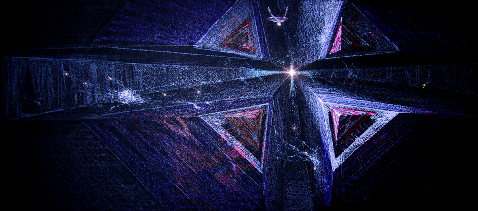
Concept illustration of the V’ger maw.
(Image: Courtesy Richard Taylor)
The Enterprise would finally arrive at the front of V’ger and the giant maw would open. This was going to be this beautiful yet frightening animation of these massive moving parts that were bilaterally symmetrical. Whenever humans see bilateral symmetry we automatically interpret the shapes and tend to see faces in the composition.
Gore: Gotcha.
Taylor: So the outside surface of V’ger was going to be made of multiple layers of photo-etched metal patterns that you could see down through as the Enterprise flew over them. It wasn’t going to be a solid surface but rather a complex layered structure.
Gore: Like a multi-plane surface?
Taylor: Yes. Exactly, it was going to be photo-etched metal panels, where etching cuts through the metal to make detailed elaborate patterns.
Concept illustration of the V’ger maw.
(Image: Courtesy Richard Taylor)
But added to that; I had found this liquid material that you could coat something with that when heated would change color. It created iridescent colors like oil on water that animated with heat.
Gore: Yeah. So it had almost like the thermal t-shit ink that changes color under heat.
Taylor: Exactly. So I found a material with which we could cover the metal and then when the motion-control camera would move over the model it had a heating coil and fan underneath it that was blowing hot air out in front of it so as the camera moved along over the surface the colors in front of the camera would change colors like the surface was reacting to the Enterprise.
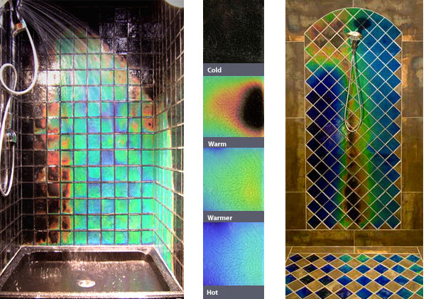
Heat-sensitive color changing ceramic shower tiles. (Image: Courtesy Moving Color Studios)
Gore: Wow.
Taylor: It would have been killer cool.
Gore: It’s sounds like it.
Taylor: There were many things that V’ger was going to do. But when EEG (Entertainment Effects Group) took over they threw it all out and created a whole new approach. My good friend Syd Mead was brought on to help develop the new look of V’ger.
Speaking of that did you ever see my drawings of the full V’ger ship?
Gore: I’ve seen a few of them. I’ve seen one where it was sort of a long organic structure, and I also saw another one that looked sort of like an elongated squid form or something. So I’m not sure which design you are referring to.
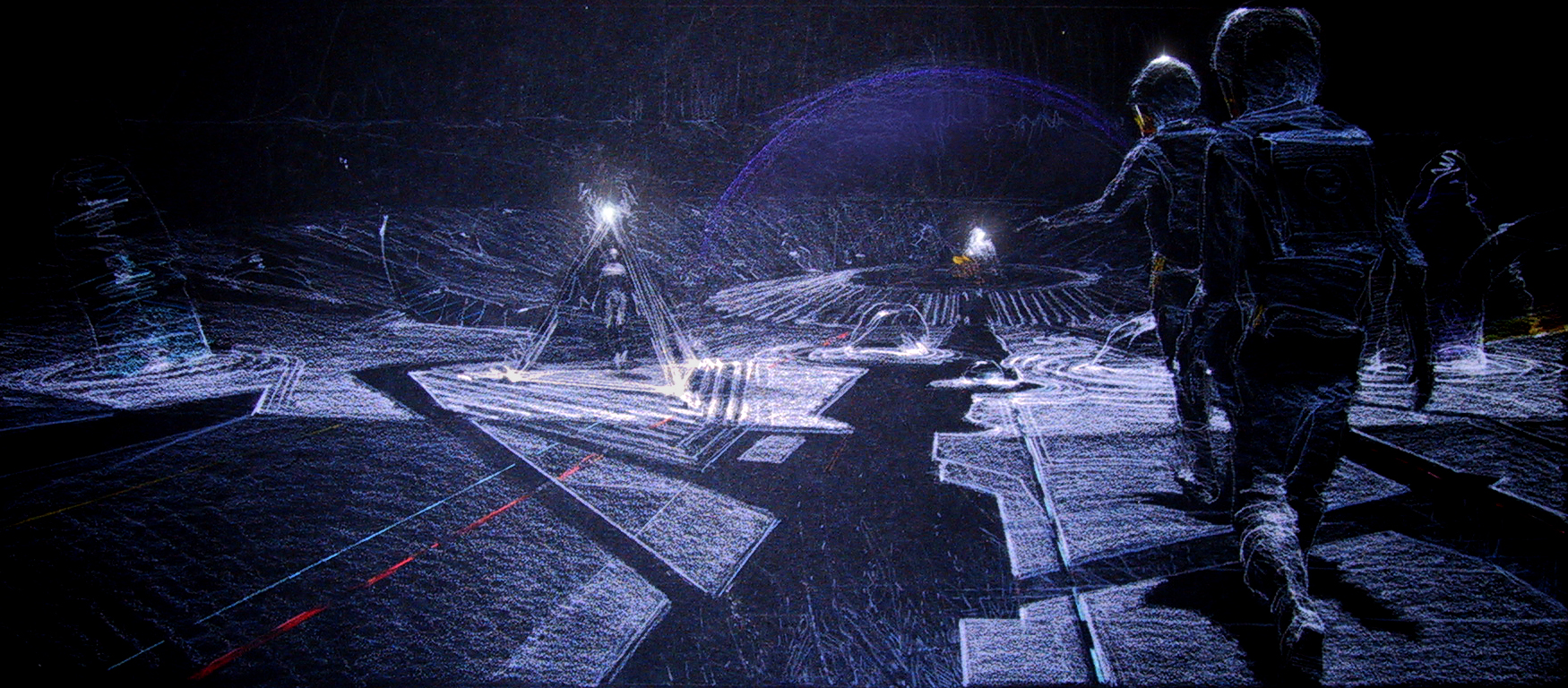
Concept illustration of the V’ger alter, with members of the Enterprise crew walking towards it from the near-by Enterprise.
(Image: Courtesy Richard Taylor)
Taylor: Well I’ll send some to you. The whole thing was supposed to be over twenty miles long and my concept you were never going to see the whole shape of it ever. You were only going to see parts of it. So I had designed it for the Enterprise to go in through the maw at the front and to travel through V’ger to finally get to this giant sphere that was going to be a mile in diameter and floating in the center of it was the Voyager island site where the actual Voyager probe was enshrined. It would be embedded in this floating island, which they would dock with and walk out onto it for the final sequence with Ilia bonding with V’ger.
You have probably seen my drawings for what the Voyager alter, or island. My design was very organic and the Voyager probe was surrounded with all these pieces of space debris and objects that V’ger had found on its journey in search of returning Voyager to it’s home planet.

Concept illustration of the V’ger alter, with embedded objects it encountered on it’s journey back to Earth.
(Image: Courtesy Richard Taylor)
I designed V’ger to be a living machine.
But what (Harold) Michelson and those guys ended up designing and building was very “Earth bound” techno-mechanical design that wasn’t something you’d never seen before.
I’ll send you some of those illustrations in case you haven’t seen those drawings.
Gore: Well I saw one drawing, and I think it was one of your design concepts, for the inner V’ger chamber and it had a lot of, as you were saying more “organic” sort of lines and shapes of light and such. Which for me harkens back to another film project that you had worked on, and that was TRON.

Concept illustration detail of the V’ger alter with he Voyager Six probe inside it.
(Image: Courtesy Richard Taylor)
Where it has ribbons and shapes made of light as opposed to the more mechanical, oversize greeble structures of the V’ger pit, which ended up being the set they designed.
Taylor: Yep. You got it. That was a perfect description of it. An oversized greebles set, is what they ended up with. What you are probably talking bout with TRON is the MCP and the ground plain surrounding it. But you know TRON was done was released in 1982 which was three years after Star Trek.
Gore: Yeah. I knew which one came first, it’s just that I thought it was interesting to see almost a progression from some of the ideas you seem to have had for V’ger that had an influence or a thread of design to the aesthetics of TRON. Because I saw some of your concept drawings for V’ger and I was like “wow, those have an almost TRON-like quality to them.” and then when I found out you worked on TRON, I was like “Oh, well that makes sense.” I can see the creative connective tissue through the two films.

Scene from TRON of prisoner programs being escorted to the doom inside the MCP mesa.
Taylor: Yes. Well, are there any more questions about the Enterprise itself you want to run by me?
Gore: Well, I think I have gotten through most of my list of questions that I had ahead of time. I’m sure I’ll have a ton of questions later down-the-road that I’ll think of after-the-fact. Which is sort of the story of my life.
(both chuckle)
I totally appreciate the amount of time attention you have given me on this. And if you could send me the stuff you have mentioned, that would be great. Again, I’m ecstatic and appreciative of your indulging me with this conversation which I hope to share with others, and with the larger fan community as well.
The Enterprise in dry dock, displaying
its pearlescent paint job to good effect.
(Image: Courtesy Richard Taylor)
And if by any chance you could put a bug in Jim Dow’s ear, or anyone else on your team from back then, I would love to have follow-up conversation with them to flesh out some of the other details that you didn’t have knowledge of directly, that would be great. All with the goal of helping build out the documentation of all the things that went into this iconic film.
Taylor: Right. Well I will definitely get in touch with Jim. I’m going to send him this PDF you sent me so he can check it out. He and I are good buddies.
The design and building of the Enterprise and the other models for Star Trek: The Motion Picture was definitely a team effort. Frank Gehry when he design’s a building, doesn’t personally draw and design every bolt and beam by himself. It’s a design firm. And while I was the primary designer, others certainly were involved and had a hand in shaping what was the end look of the models in the film. Jim Dow and the incredibly talented team at Magicam as well as Andy Probert, Matt Jeffries, Chris Ross, Mark Stetson, Tony Smith, Michael Sterling and many others all contributed.
So it wasn’t singular.
Working out some of the details that were done at Magicam, by Jim Dow, Mark Stetson and Chris Ross and so on were part of it. They would come to me and say “Richard, this part isn’t working, we have a suggestion, what do you think about this” and I would work with them to come up with a solution.
And of course Paul Olsen, who was brought on to apply the amazing paint design of the Enterprise, which was an incredibly complicated and time consuming process to finish.
Gore: Absolutely. That’s definitely one of the more elegant aspects of the look of the Enterprise as it appeared in this film. The paint job that he applied that you helped develop with him. I thought it was just incredible.
Modeler reproduction of the famous
pearlescent “aztec” paint
pattern on the main saucer.
(Image: Courtesy Orbital Drydock)
Taylor: Yes, the famous “aztec pattern” which was worked out by the guys at the Magicam model shop in order to figure out how how Paul was going to make all of those masks that Paul as going to have to apply and then paint.
It was my concept to basically solve the problem of detailing the big expansive areas of the Enterprise. We couldn’t cover the surface with hatches and cover it with greebles like other science fiction films.
So the texture of the big open surfaces of the Enterprise is a texture created by the difference in specularity and color of metallic and pearlescent paints. The different qualities of the paint crated a pattern of metallic panels that covered the surface of the Enterprise. That was all done with Crescent metal powder and pearlescent paints airbrushed onto the surface with different masks to crate the pattern.
It was a labor of love on Paul’s part.

Ad in American Cinematographer by
Magicam, thanking the staff, February 1980.
So there were many people who contributed to what the Enterprise finally became. Yes, I was at the tiller but I didn’t design every aspect of it. In the end I directed and approved everything that went into it’s design. But my point is that it was a design team. There is not a designer of the Enterprise. Some websites will say I was the designer and there have been others that believe they have that title. But they were not. I think it really was a group effort and I loved working with that incredibly talented team.
Even Trumbull added piece into it. The top and bottom part of the saucer, and some other things that they did here and there. Subtle things most of them.
Doug (Tumbull) was one of the guys that helped create the Magicam model shop. So when we were building these models he’d come over and I could see he was really kind of going… “Holy shit. These are turning out a lot better than I thought.”
(both laugh)
And he was like “Oh man, I’ve got to get in on this.” And in the end he did, as far as finally shooting it all, and getting it all done.
So again, the movie was a complicated project all along.
It was the first feature film I had worked on. And after I left there I worked with Terry Malick for a year and then I did Looker, and TRON.
Star Trek was a movie that was, I think a knee-jerk reaction to the success of Star Wars. And that’s why they decided to make the TV film a feature film. It didn’t really have a director initially. There was a committee of people that were involved in making these decisions starting with Roddenberry. (Jeff) Katzenberg was the producer and it was the first film he had produced.

Publicity photo on the set of the movie, Star Trek: The Motion Picture, from left to right: Leonard Nimoy, Robert Wise, Gene Roddenberry, DeForest Kelley and William Shatner, November 8, 1978. (Image: AP)
Initially when we got involve it was being done by committee. Which is not the way to make a movie. It was great when Robert Wise came on, to give it some structure.
But the process of designing for the movie, the storyboarding and so forth, was really complicated. When I would make a presentation for any of the designs, like the Vulcan shuttle, or the workbee, I’d have these beautiful drawings done by the team.
I soon realized that if I went into the presentation and said “here’s what I think the design for the workbee should be,” that this committee would go into this free-form discussion about it that would spiral off into everyone’s opinion. . it was frustrating and very counter productive.
I would present research I did as a part of the designs that I acquired from the guys at JPL, as to how they would build something like that.”
And Gene at any point would say “No that’s not the way they would build this in the future.”
(both laugh)

Scene from Star Trek: The Motion Picture,
of the Enterprise going to warp speed after Spock re-balances the new engines.
At one point I had actually acquired some research film that was done by M.I.T. about what something might look like when it approached the speed of light, which I showed them as part of storyboarding what happened as the Enterprise made the transition to light speed. And Roddenberry would say, “No, no, no. That’s not what happens when you go to light-speed. Here’s what happens…”
(both laugh)
Gore: Oh what do those JPL guys know about rocket science?!
(both laugh)
Taylor: Yes. Well and we would have astronauts come in occasionally. And I would say “here’s an escape hatch here..” and the guy would say “yeah, that’s good.”
But Roddenberry would be like “No, no, no. That isn’t what you would do.” and make these kind of arbitrary decisions. Some of which were crazy decisions about the design of the bridge.
The bridge really needed a lot of work. And he had some very, very rigid ideas that he would say “nope, this is what you are going to do.”
Scene from Star Trek: The Motion Picture,
of Kirk’s bridge chair with the new
lap-restraints engaging as the Enterprise
enters the wormhole.
The first thing, and it took me a long time to convince him to do, was to design the chairs on the bridge so that they folded in over the people so they had safety restraints.
That’s one of the things that drove me crazy about the original television series. They’d get into turbulence and people would be falling around the bridge acting like they were inside a washing machine.
I mean Christ we have seat-belts in cars now, and every airplane has seat-belts. Yet, these people are centuries in the future and they haven’t figured out how to get into a chair and put on a seat-belt?
(both laugh)
So eventually he finally agreed to have the arms fold-up over their laps in order to keep them in place in their chairs when they were going through the wormhole or any of that kind of stuff.
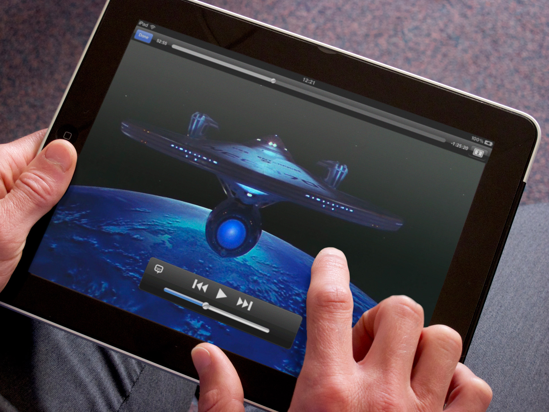
The now commonplace tactile user-interface “touch” screens such as the Apple iPad.
But I wanted to do the bridge controls, the helm etc. out of tactile screens. I had research material that they were starting to make control panels for nuclear power plants and so forth with tactile screens.
Gore: Basically the forerunner of what eventually became iPhone and iPad screens.
Taylor: Yeah exactly. And they were doing that at Lawrence Livermore and so forth. So I brought that in and said “look, they are making screens now so we can have them animate.” They could touch it and the surface would animate different control configurations. Kind of like David Werner’s office desk top in Tron .

Scene from TRON, Dillon logging
into the MCP interface via the tactile
surface/screen of his office desk.
Gore: Yeah.
Taylor: Basically, you could animate it, and have all these things slide and move. So visually it would be really great. And we would have done it with rear-projection so we wouldn’t have had to matte it all together. We would have built the console so it would have had rear-projection. It would have been really, really cool for the time.
And Gene said “No, I want switches. I want buttons and toggles.”
So we ended up doing old-school stuff.

Enterprise bridge science station console set, re-used for Star Trek: The Wrath of Khan.
(Image: ex-astris-scientia.org)
And then around the perimeter of the bridge I wanted to make that one continuous screen that changed designs based on what was going on. So the crew could touch it and things would animate. And he said “Nope. I want circular screens there.” …or oval screens.
And I said, “well you know sir, circular screens are the most inefficient screen shape to display data?” …you know rectilinear screens (like the propositions of sheets of paper) you get more information on it. Circular screens are really not efficient to convey information.
And he said “Goddamnit Taylor, I want circular screens around the perimeter of the bridge. And I want abstract images on those screens.”
And I said.. “…alright, that’s what we’ll do.”

The “ops” console on the Star Trek: The Next Generation bridge set.
Gore: Well the real irony there is that is pretty much all of what became the user interfaces, tactile screens like those which eventually became real in the form of iPhone and iPads and so forth, are what were shown on Star Trek: The Next Generation in the mid-80s. So it’s kind of ironic that even Gene Roddenberry and everyone, eventually came around to your point of view on the bridge interfaces.
Taylor: Yeah. So there are all kinds of things like that going on about the production. But I was able to get the navigational sphere in the middle of the bridge that came down from the ceiling, right above the con?
Gore: Yeah. The green artificial horizon globe in the middle of the ceiling.

Bridge ceiling dome artificial horizon navigational display set-piece.
(Image: Hollywood Relics)
Taylor: Yes. And then also got the proportion of the view screen to be wider, and wrap around the bridge a bit more. Subtle details here and there that we were able to get into the set.
But there were just a lot of fingers in the pie, in trying to get these things designed. So I went into a meeting and I would put up a drawing of the Vulcan shuttle knowing that there was no way that the first thing I showed them would ever be approved.
So I would show them multiple designs and let them argue and chew over them. And the design I really wanted would be buried about four or five deep in the stack. So when we got down to it, they would be like “wow, that’s good!”. And I would be say “I don’t know about that…” and they would be like “no, no, that’s really good.”
(both laugh)
Gore: That’s so funny. As a fellow designer it’s funny how we us some of these social engineering skills that we have all sort of landed on. Because I know in my work in the past, on the design teams I have been a part of, we would usually put the image section or design we liked the most that we wanted to put in front of a client, we put the ones we liked the most kind of in the middle to the end of the stack…
Taylor: Yeah… (chuckling)
Long-range Vulcan Shuttle
concept drawing by Andrew Probert.
(Image: icollector.com)
Gore: … so the client totally goes to town and beats the hell out of the first couple of them. Then by the time they get to the ones we preferred, they are either worn down or come around to where you want them to be. And often end up picking the ones you really liked in the first place.
(both laugh)
Taylor: Yeah I know. Having directed hundreds of commercials, I know that game inside out and backwards. But yes, I wanted to ask you a couple of other quick questions here.
This CG model that was done by Tobias Richter, do you know him and did you talk to him?
Gore: Actually I don’t know him directly. But I have seen his name mentioned a couple of times and have seen him in some of the online groups I am a member of. But I am not overly familiar with his involvement in things.
Orthographic CG model of the Enterprise.
(Model & Textures by Tobias Richter)
Taylor: Right. But you’ve seen the orthographic views he did that I sent you?
Gore: The renders of the CG model orthographic views? Yes I have seen those before.
Taylor: Yes. So that’s one CG model, and then there’s Darren Dochterman who did another one, which was used was used in the Director’s Cut.
Gore: Yes. I have actually spoken with him online last night while prepping for this interview with you. Yes he made the one which got used in some of the shots by Foundation Imaging for the Director’s Edition DVD.
And that’s some of the things I have looked at. There are subtle differences between them, and with what I have derived as well. That’s why I wanted to reach out to you and others and try and go back to the original source info on building the physical model and drill down to get the excruciating details correct on it.
Taylor: Yes. Well good, because between the Tobias Richter CG model, and Darren’s, those are both beautifully crafted CG models of the Enterprise.
Gore: Agreed.
Taylor: There’s a lot of detail in them and I know they spent a lot of time getting those things right. So I just wanted to know if you had talked to them or where you stood with them as far as that goes.
The other thing I wanted to mention were the strobes on the Enterprise.
Gore: Yes.

Scene from Star Trek: The Motion Picture,
of the Enterprise self-illuminating lights powering up before leaving dry dock.
Taylor: Those were intentionally placed to emulate aircraft safety lighting systems of today. One of the essential lighting ideas built into the Enterprise was the decorative/functional display lighting of itself.
When you see commercial airlines at night, their tails are lit-up and not for any functional reasons other than marketing. So I thought the Enterprise needed decorative and functional lighting to shine light on its numerology, like the one that lights up the NCC-1701 on the saucer and the others that light up the nacelles and the side of the lower fuselage.
Gore: Where the pennant is?
Taylor: Yes, the lighting on the pennant. The self-lighting really gave the ship a whole other look and gave it scale.
Cruise ships are lit up decoratively. So I figured the Enterprise should have the same kind of treatment.

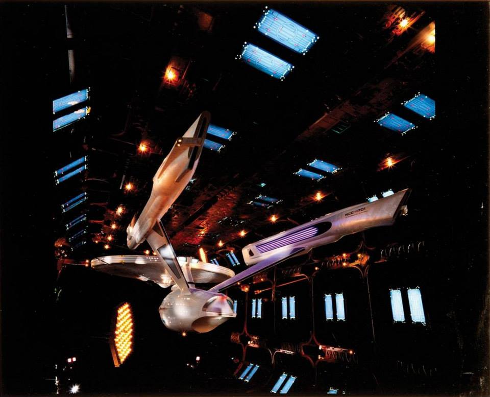
Beauty shot of the Enterprise model,
with full self-illumination.
(Image: Courtesy Richard Taylor)
Gore: Well for me, even in the original series, and the later Star Trek films even though the later films used the same model, they didn’t seem to use the dramatic self-illumination aspect of the Enterprise as it appeared in this film.
And to my eyes, that is what really sold the Star Trek: The Motion Picture iteration of the filming of the miniatures as being in deep space. Because there is no major key-light coming from a star, or the sun. So it would need to self-illuminate.
So I think that’s one of the things that really helps sell the midnight of deep space is the fact that it did have to be self-illuminating.
That was one of the things that, even in the original television show, always bothered me. The Enterprise is always bathed in light and glowing no matter where it is in space.
Taylor: The point being that the lighting also gave it a sense of scale. But yeah, I just wanted to mention that one very specific detail about some of the lighting tricks that were built into the ship. Another detail were the strobes on the top and bottom of the Enterprise.

Boeing 787 with its taxi and running lights on.
(Image: Courtesy Aviation Stack Exchange)
Gore: Ok, this is total nerd-dom from my perspective, and an indication of how nutty I am and I hope I am not boring you with it. But that’s one of the things that I think is both ingenious, and simultaneously odd, is the actual aviation lights and those that are on open going vessels is that was applied to ship. And that is having the green and red running lights on the port and starboard sides of the saucer.
Taylor: Yes
Gore: And you kind of touched on one of the aspects of it that kind of makes it funny in a way. Is that there is no “up” or “down” in space. I mean the only reason that there are those kinds of colored running lights on ships out on the ocean is that the ship is never inverted. On the open sea its is never capsized (one would hope).
Where as in space you couldn’t tell if it was coming at you or going away and which was port and which was starboard side, via the running lights on a ship unless there was a third set of lights somewhere. Whether it be a blue light facing forward and/or say a yellow one facing aft or something. That would allow you to distinguish, ok this is the top of the vessel and this front or back of the vessel to be able to determine is it coming towards you or not.
Photo of the workbee filming miniature,
showing the green starboard-side running
light, and strobe light on top of the craft.
(Image: Doug Drexler)
That’s just one of my one little moments of going… “hmmm.”
I mean it’s a great visual nod, but it also doesn’t make a whole lot of sense in some ways when you are dealing with vessels and craft in space.
Taylor: Yeah. Well I put them on there because airplanes, ships etc. all have them today. When you are taxiing through docking areas and so forth, and it’s dark and you need to know if you are on the port or the starboard side of an oncoming vessel is essential for safety.
But you are actually right. If you are in space and something is “upside down” well then yeah, the whole theory goes out the window. But I’m sure Starfleet Command would ensure that in the dry docks and docking ports where multiple craft are moving around together they would have some way of orienting the traffic.
Gore: Yeah I notice that carried over into the workbee (and travel pod) models as well. Which is something, ironically, that I really, really like even though I question the practicality of it in space.

Original dry dock model, with some detailing that could be salvaged and used in the final model. (Image: Courtesy Richard Taylor)
Taylor: Well another aspect too was that my original designs, and those pictures you saw with Roddenberry and us over at Magicam looking at those different models, and the dry dock , you could see there was a rectilinear dry dock model. It didn’t have much scale because the parts were so large. The thrusters on the corners, the trusses etc. It looked small even though it wasn’t and lacked a sense of scale. Especially if the Enterprise was inside.
There were aspects of it that were great like the hexagonal lighting panels. So all along we used anything that Magicam had created that could be incorporated into the new designs.
Initially I wanted to make the dry dock an elongated hexagonal cylinder, that when we first saw the dry dock it was upside down and throughout the shot of the approach to the Enterprise it would rotate into a horizontal position.

Behind-the-scenes photo of the final dry dock model being paired with the Enterprise model. (Image: Courtesy Richard Taylor)
I wanted to show that there is no right-side up or right-side down in space. But Roddenberry hated that idea. No, he wanted it to be rectilinear, and to remain horizontal in it’s position. . . so that’s what it ended up being.
The most difficult thing I had to do on the movie was to create that red glowing thing on Ilia’s throat.
Gore: That’s what on the neck?
Taylor: On her throat after V’ger had taken her away.
Gore: Oh, the glowing crystal on Ilia’s neck?
Taylor: Yes.
Gore: Gotcha. I thought maybe you were talking about the Klingon or Federation torpedo tubes something there for a second. But I get what you are referring to now.
Taylor: Oh my god. That was unbelievably complicated and stupid. They insisted on having that glowing thing on her neck. Now this was pre-digital, so we couldn’t rotoscope or pixel track her, or in post-production add it because she was acting and walking and talking and moving and the camera was moving as well.
So it had to be a physical thing on her neck that actually glowed.

Persis Khambatta portraying the Ilia/V’ger probe, with the infamous lighted crystal embedded in her neck.
So to make that, without any wires that went around her neck. It had to be adhered to her neck, and have lights built into it. Again the only lights that we had (we didn’t have LEDs) were tiny grain-of-wheat lights. To power them in this tiny neck light I had to use the smallest little micro batteries (1979) made for hearing-aides. So we had to design and build these tiny units from scratch. We made multiples but I can’t remember exactly how many.
The problem was that they would only last once turned on for around two to three minutes before they would burn out, right?
So if you know anything about shooting on stage with actors, and sets, and multiple takes; anything that has to be changed continually, or burns out half way through a take, everyone on the set is going to hate it. Mostly ME!!
I did have a version of the unit for medium shots that had two tiny wires that were incredibly fine, which went around her neck to a battery pack.

Publicity still of the Ilia/V’ger probe, with Kirk and Decker with Spock in the background.
But for any of the close-ups I had to literally adhere it to her neck. I’d turn it on, put it on her neck, step away… and action. Well some times they’d fall off, and other times they’d burn out or the battery would die out. Then it would take forever to fix and replace and everybody hated it. I HATED IT. I mean who the hell came up with this idea and did it really make a significant difference in the film?
And all they had to do was say; “there is a piece around her neck with a glowing jewel on her throat.
I mean.. the audience wouldn’t have gone “Oh! That isn’t right!” I mean V’ger put this glowing thing on her neck it could have looked like some really techno design. So, if Rodenberry or Wise would have just let me change the design to something that would have looked cool like a necklace or chocker that could have been practical and that would have worked take after take it would have been easy… but they wouldn’t. So that gag was really, really a pain in the ass! The pressure of having an entire film waiting on me shot after shot, trying to keep a little light glowing on the neck of a main character …it was a frick’n nightmare.
Gore: That would be awesome. And again, I really appreciate the time you have given me, and for following up on all that stuff as well. That’s awesome.
Taylor: It’s been a pleasure to meet you, and again thank you for your dedication and enthusiasm for the film and the work by the many folks that went into the design, building and photography of the models. It’s terrific and I don’t really have a problem at all trying to help you out. You are doing it from the right perspective. So I appreciate that.
Gore: Ok, great. Thank you and hopefully down the road we can connect up again and talk some more if you have any interest in that. Like I said, I really appreciate it and will share all I can with the larger fan-base about this stuff. And archiving a lot of this material so everyone else can appreciate it.
And again, thank you for your time.
Taylor: Mitch. Thank you. I will see you down the trail, live long and prosper.
Gore: And you too. Thank you very much.

Pingback: Richard Taylor Interview (part V) | Third Wave Design
Pingback: A Side of Blues | Third Wave Design
Pingback: Uniform Seating | Third Wave Design
Pingback: AI GOD – PART 3 – THE CHURCH – Eye Opening Truth
So basically GR’s stuff was terrible.
LikeLike