
Started back in on some digital illustration work I had begun as part of working on both the Enterprise cross-section studies and for the workbee schematics, before the opportunity to interview Richard Taylor came up. And that was working up new and improved human figures to use to establish ergonomic and scale/clearances in future schematics and illustrations.

23rd Century human form-factor illustration, based on Leonardo da Vinci‘s Vitruvian Man and a starfleet uniform illustration.
I had been using an illustration I had done in Adobe Illustrator for the purpose of showing scale and human form-factor clearances in the schematics and design illustrations for the Enterprise interior elements as well as for the workbee drawings.
That illustration was based on one of the Starfleet uniform illustrations done by Aridas Sofia in one of the old fan-made Star Trek Federation Reference Series technical manuals done back in 1985, married with a modern take on Leonardo da Vinci‘s Vitruvian Man.
Talk about everything old being new again.
But when starting to work out some deck-height options to see what would work within the saucer of the Enterprise based a conversation I was having online with someone I am working together with some starship blueprint designs, I realized that I didn’t have a very good “pose-able” illustration for showing humans in the drawings for scale purposes. Nor was it one that was 100% correct proportionally.

“The Measure of Man and Woman: Human Factors in Design” by Henry Dreyfuss Associates.
This started me down another deep dive and looking into human form factor and ergonomic data and illustrations. That in turn lead me to come across the work of Henry Dreyfuss. Or to be more precise, The Measure of Man and Woman: Human Factors in Design, by Alvin R. Tilley, Henry Dreyfuss Associates, first published in 1993.
This was a newer version of Dreyfuss’s earlier work from 1955, when wrote Designing for People, an autobiography that detailed his principles of anthropometrics. This book was followed by Henry Dreyfuss Associates’ The Measure of Man in 1959.
Henry Dreyfuss was an American industrial designer and his design firm received worldwide recognition for numerous designs for a vast spectrum of consumer and commercial products, including their long-time association with the Western Electric company and the Bell System for designing telephones from the 1930s through the 1960s. His design philosophy was based on applied common sense and scientific principles and resulted in significant contributions to human factor analysis and consumer research.
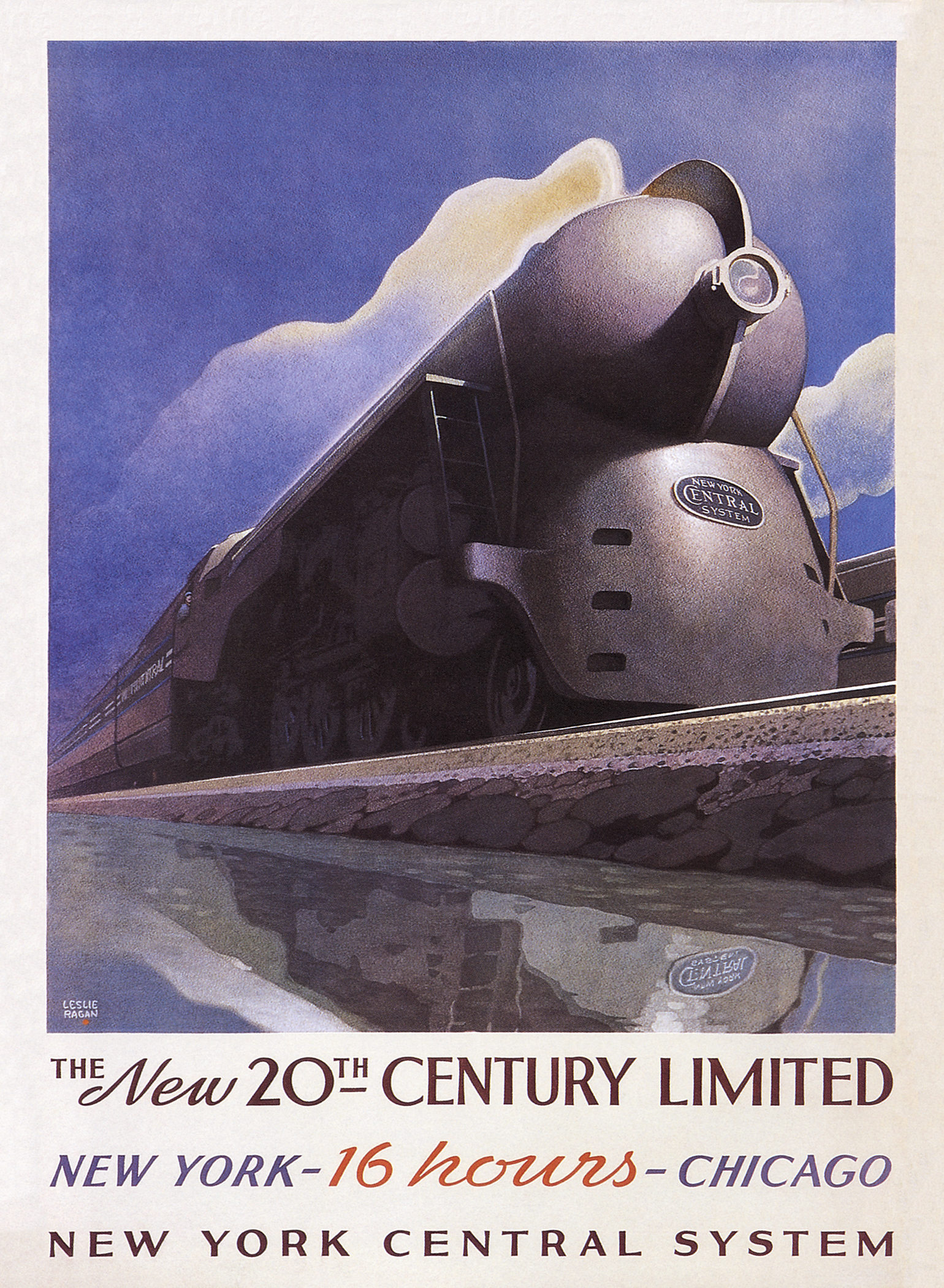
Iconic 1938 art deco poster by Leslie Ragan
for NYC’s 20th Century Limited featuring the “Hudson” locomotive designed by Dreyfuss.
As opposed to Raymond Loewy and other contemporaries, Dreyfuss was not a stylist: he applied common sense and a scientific approach to design problems. His work both popularized the field for public consumption, and made significant contributions to the underlying fields of ergonomics, anthropometrics and human factors.
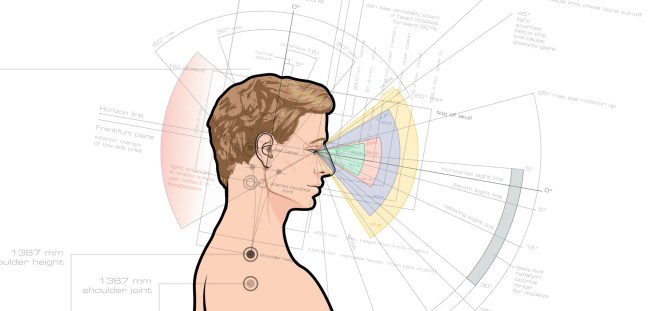
The Dreyfuss work helped codify the field of human factors through introduction of “Joe” and “Josephine,” an average male and female human form, based on a wide data set of average human morphology and anatomy.
While most of the data and illustrations are about the mean data of the 50 percentile “average” male and female forms, other illustrations represent their 1 percentile and 99 percentile male and female counterparts as well as differently abled people, those in wheelchairs, using walkers or accompanied by seeing-eye dogs.
It even goes all the way through to minimum and comfortable safety clearances ranging from the size of an opening an average human finger can fit, to the size of a manhole opening or crawlspace.
It is really an amazing and useful design resource.
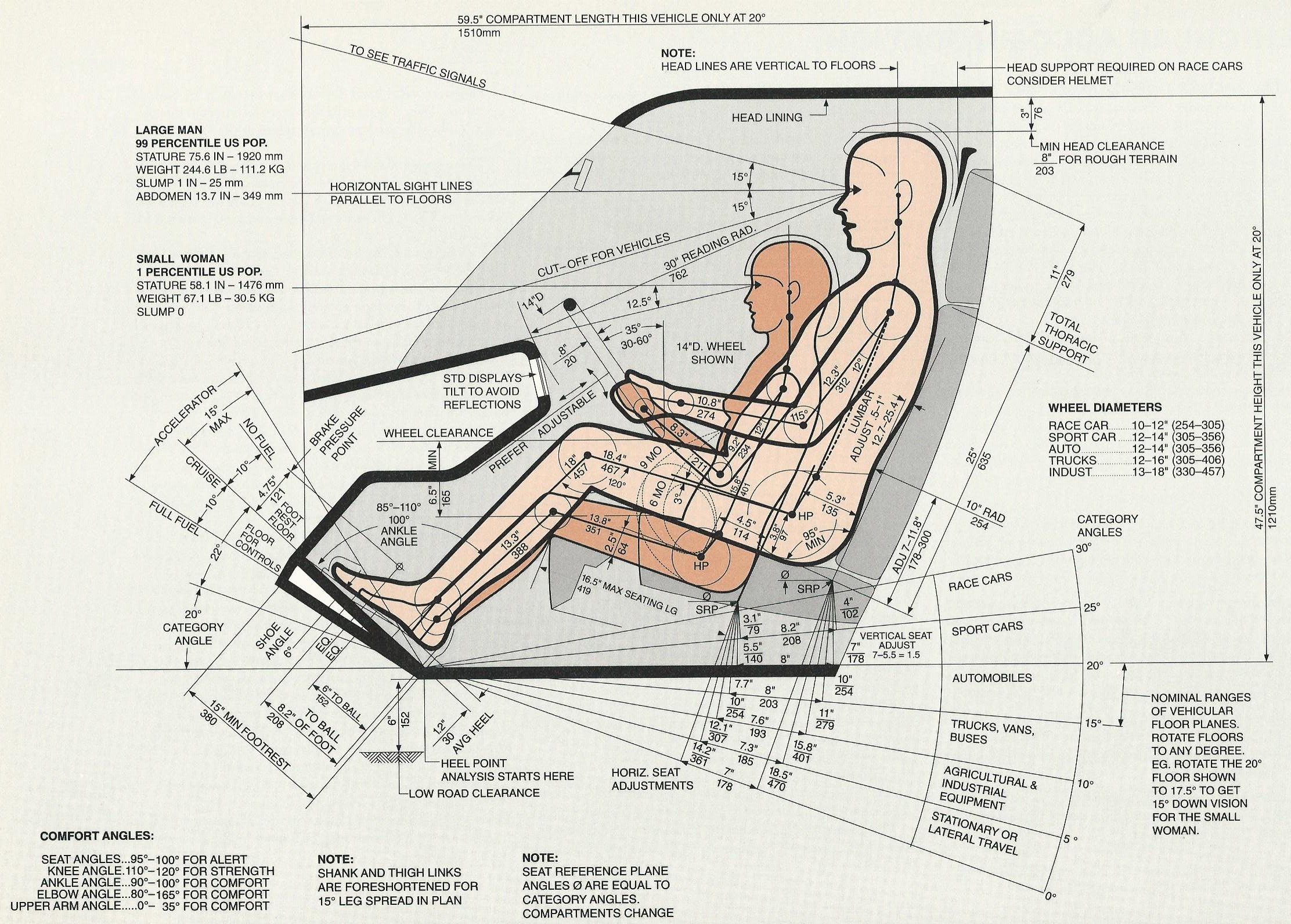
Constant Factors in Vehicle Seating. Image
from The Measure of Man and Woman.
Now how does this all tie-back to the Enterprise and my Star Trek design mania?
Well this and other data showing optimal dimensions for seated persons, workstations, and the aforementioned crawlspace clearances, some of which I found for resource material online from places like OSHA‘s website, to reading white papers from Steeelcase regarding office space and furniture ergonomics, will help me work out all the interior spaces for the schematics. Things like the service crawlspaces, or Jeffries tubes for my fellow Trekkers, will make having a well drawn, articulated and proportionally “average” human form, will be invaluable.
For example, the seated person proportions will allow me to validate and illustrate how and why the upper rows for portholes shown on the outer rim of the Enterprise‘s saucer section work perfectly for spaces inside the vessel where seating level widow viewing is desired. This in turn will help inform the types of rooms and spaces behind those banks of windows.
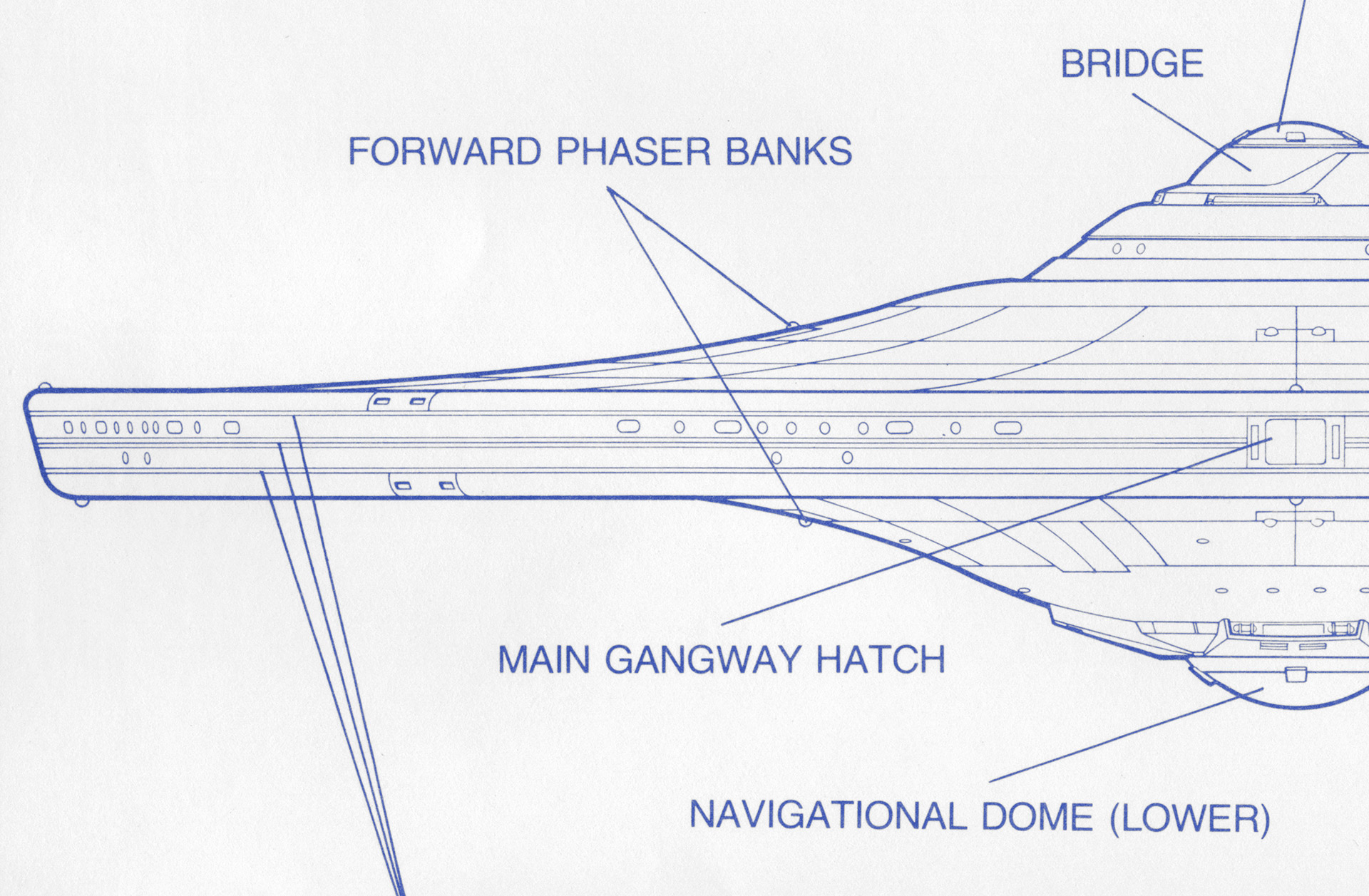
Detail of the official blueprints drawn by
David Kimble, showing the saucer window levels and arrangement.
The less than 2 meter distance between the upper and lower portholes, has lead some of my fellow “rivet-counter” modeling geeks to claim that there is now way those window configurations make sense unless the upper deck is inhabited by hobbits because they are lower than standing height viewing would comfortably afford.
But, like most airliner or even restaurant window seating, the sightlines are made to accommodate the eye level of a seated person. So those windows can be rationalized as having officer quarters or communal space where seating, or even beds (aka racks) are expected to be. Notice how in almost all residential construction in the past four of five decades, the bedroom window sill levels are barely that of mid-thigh height.
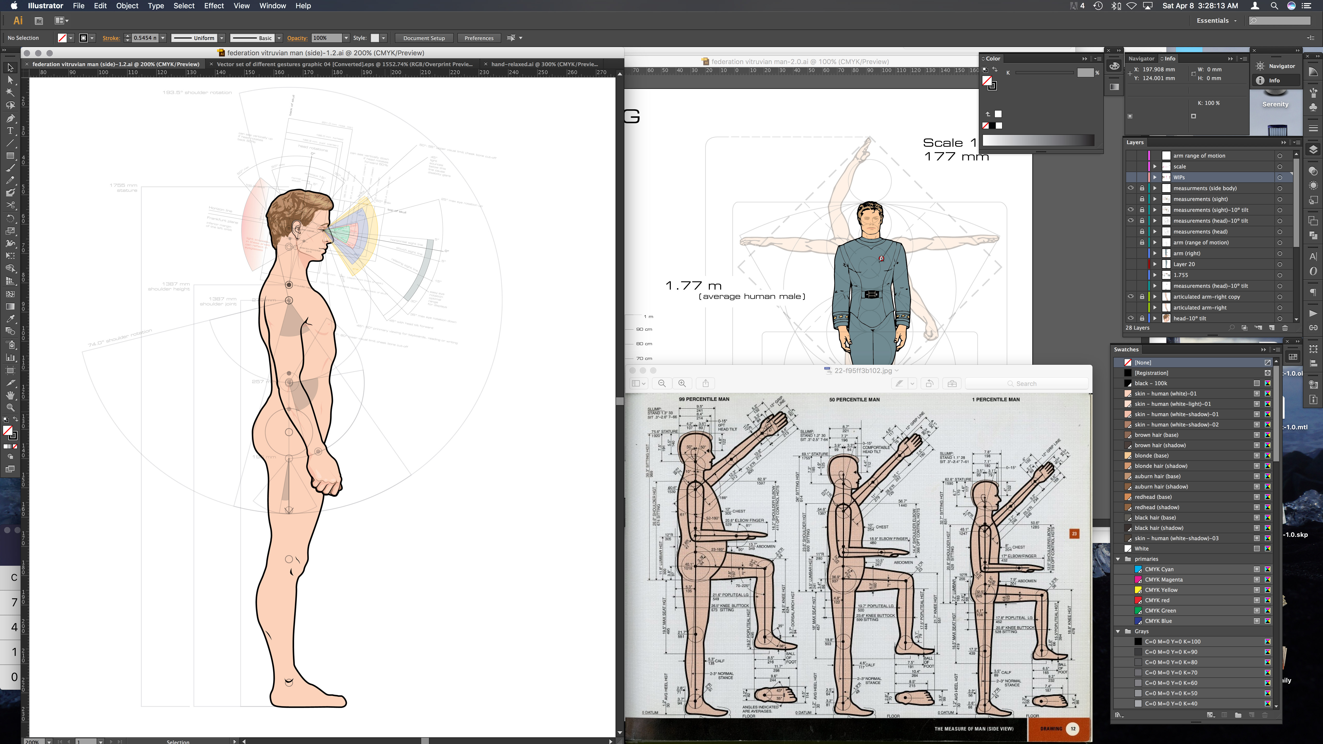
Work-in-progress side-view illustration of the average male human form
for use in schematic drawings and 3D models, based on data developed by Henry Dreyfuss Associates.
This again goes back to the age-old designer’s dictum… form follows function.
This has lead me to go back and redo my Starfleet take on the “vitruvian man” I am using in my drawings. Aside from making the illustrations truly my own and improving on them from an aesthetic stand-point (I hope)… it is being made so I can articulate them and pose the figures as needed, in addition to making all the proportions 100% accurate to the data provided by the Dreyfuss Associates work.
