
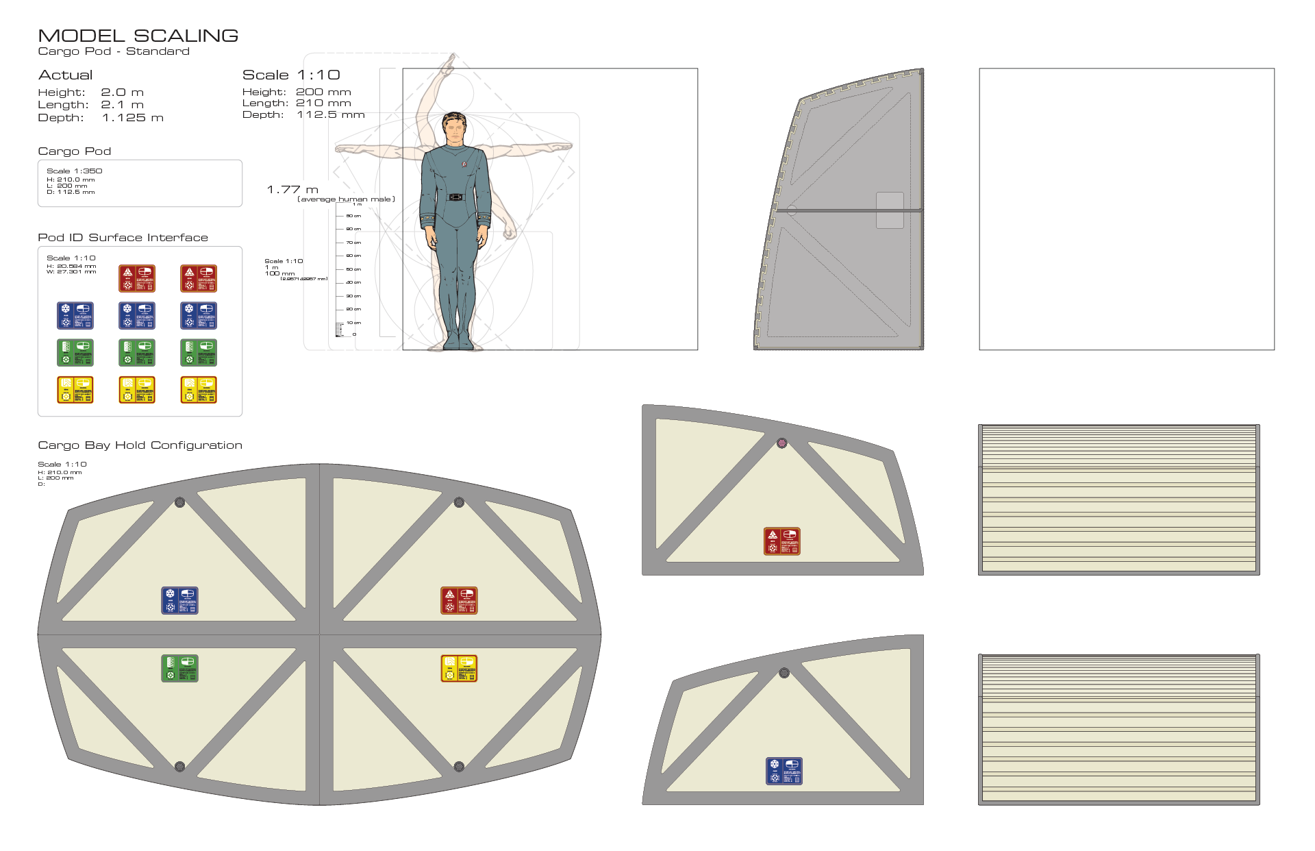
I got a little side-tracked over the weekend in that I began working on some preliminary cargo pod illustrations. These will eventually be part of the cargo-train attachment on a few of the workbees.

I had intended to do some more work on the 3D test prints of the workbee I received the previous holiday weekend, and do more work on making a more accurate aft/stern section of the workbee to run up some new test prints at Shapeways.
But my nerdiest OCD, or rather “COD”… you know the way it is “supposed” to be written (I always loved that joke, h/t Harold Metzger) …kicked in and I went off on a design tangent. The cargo pods that make up the workbee cargo train (as shown in the screenshot from Star Trek: The Motion Picture at the right) existed as a filming model, and also as on-set props for the photography of some of the live-action plates of the Enterprise‘s cargo bay shots.
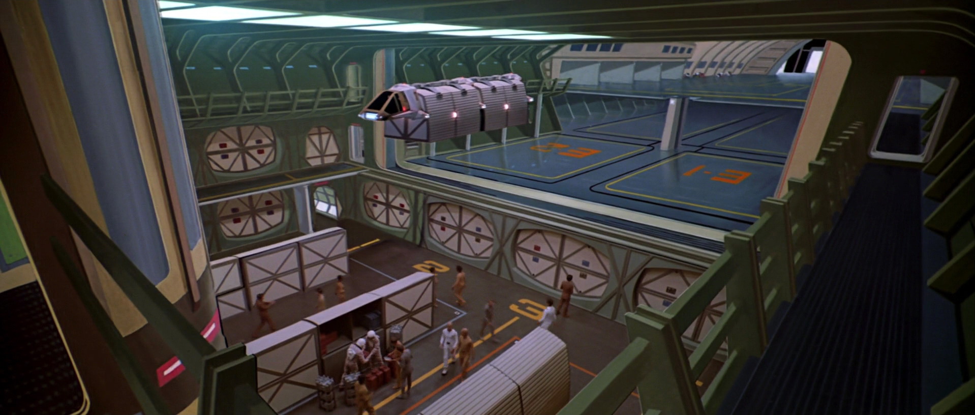
Workbee towing the cargo pod train into the Enterprise cargo hold, from Star Trek: The Motion Picture.
Of course no exact measurements of the filming model parts for the cargo pods have been unearthed (at least by me). While the general design matches the on-set props, the proportions don’t seem to reconcile perfectly.
As always the few fan-made drawings and “blueprints” are all over the map in both stated sizes as well as proportions. So I went back to the source materials as best I could, and began working out and reconciling the dimensions and shapes too arrive at a happy compromise.
This is when the insanity took over.
These cargo pods are in tandem, side-by-side configuration in sets of two in the cargo train. This is shown in quite a few shots in the movie and drawn in profile illustration by David Kimble as part of the original 1979 “official blueprints”. They are also shown in a cargo-hold configuration which make up some of the cargo bay walls.
It has always been a known challenge in Star Trek modeling circles to try and get the sets shown in the movie to “fit” logically within the proportions of the Enterprise filming model at scale. It is close, and the designers and art directors on the movie did an admirable job in trying. There are some compromises made in trying to please the director, Star Trek creator Gene Roddenberry, and others.
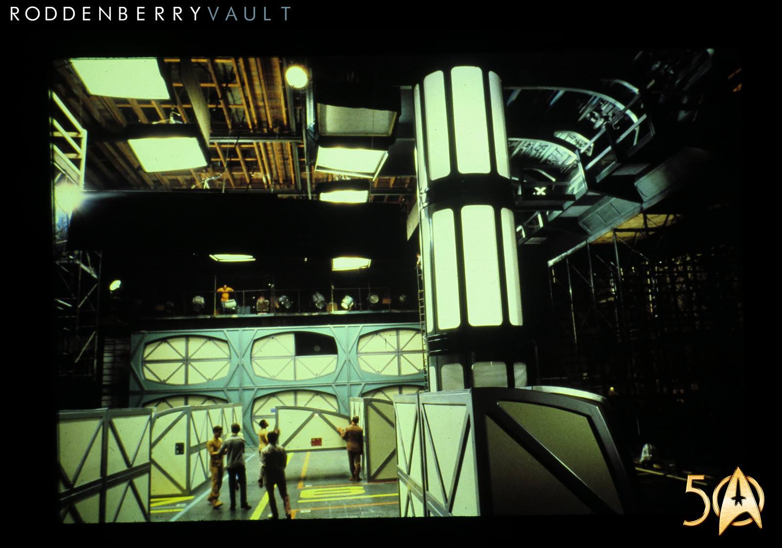
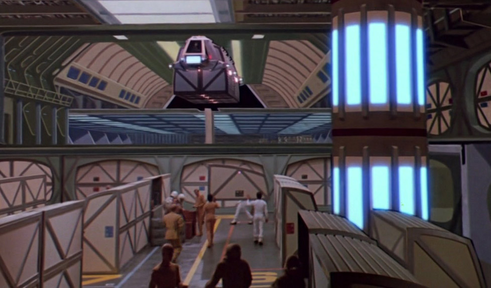
Behind the scenes photo of the cargo hold set from
Star Trek: The Motion Picture.
Andrew Probert, one of the designers on the movie, has talked at length in some interviews about trying to come up with a way to fit the live-action set footage of the cargo area within the shape of the Enterprise‘s secondary hull, and within the size which was also dictated by the general size and placement of the portholes in the ship’s hull.
This quad configuration cargo pod storage racks in the live footage and matte paintings, in theory would need to reconcile with the size of the workbee towing them in the shots flying around the Enterprise, and shown in the cargo bay itself in a couple of shots.
So trying to arrive at a set of dimensions which can both be four-wide in cargo hold racks and be in the correct proportion to the 2.7 meter workbee, as well as fitting within the filming model’s derived dimensions in addition to the live-action scene locations (identified by reverse engineering the shots and using Andrew Probert’s design sketches) was a challenge.
That lead me to begin working on the aforementioned drawings to come up with “accurate” designs that can eventually be brought into the 3D modeling software to make it “fit” within the Enterprise hanger area within the model, and then eventually run off 3D printed pieces to go with the still in progress workbee 3D print designs.
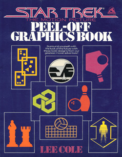
“Star Trek: The Motion Picture Peel-Off Graphics Book” featuring graphic designs by Lee Cole.
Adding to this is fact that everything in the Star Trek universe is, logically, metric. However a lot of the models and sets were made with good old-fashion, pain-in-the-ass, imperial sizes (i.e. feet and inches).
So I went the extra step and idealized the given set dimensions (when I had them) and model sizes to the nearest logical metric equivalent.
With me so far?
Good. Now onward to another level of madness.
Those cargo pods have colored labels on them. There was some pretty cool artwork made by the late Lee Cole, a designer on the movie and creator of the graphic symbology on the sets used on the movie. Some of her graphic designs ended up in the book “Mr. Scott’s Guide to the Enterprise” as well as a sticker-book made as a promotional kids book for the original release of the movie.
A 3D modeler and blogger Basill a few years back, who was also enthralled by the cool graphic design of the signage on the Enterprise sets, dug up some of her designs and made some Photoshop examples of the cargo labels.
I took these and various other sources and created new vector-based artwork for these cargo labels working off of Lee Cole’s original designs and the general aesthetics she established for the movie set graphics. Fair enough you say?
Prepare yourself for more crazy.
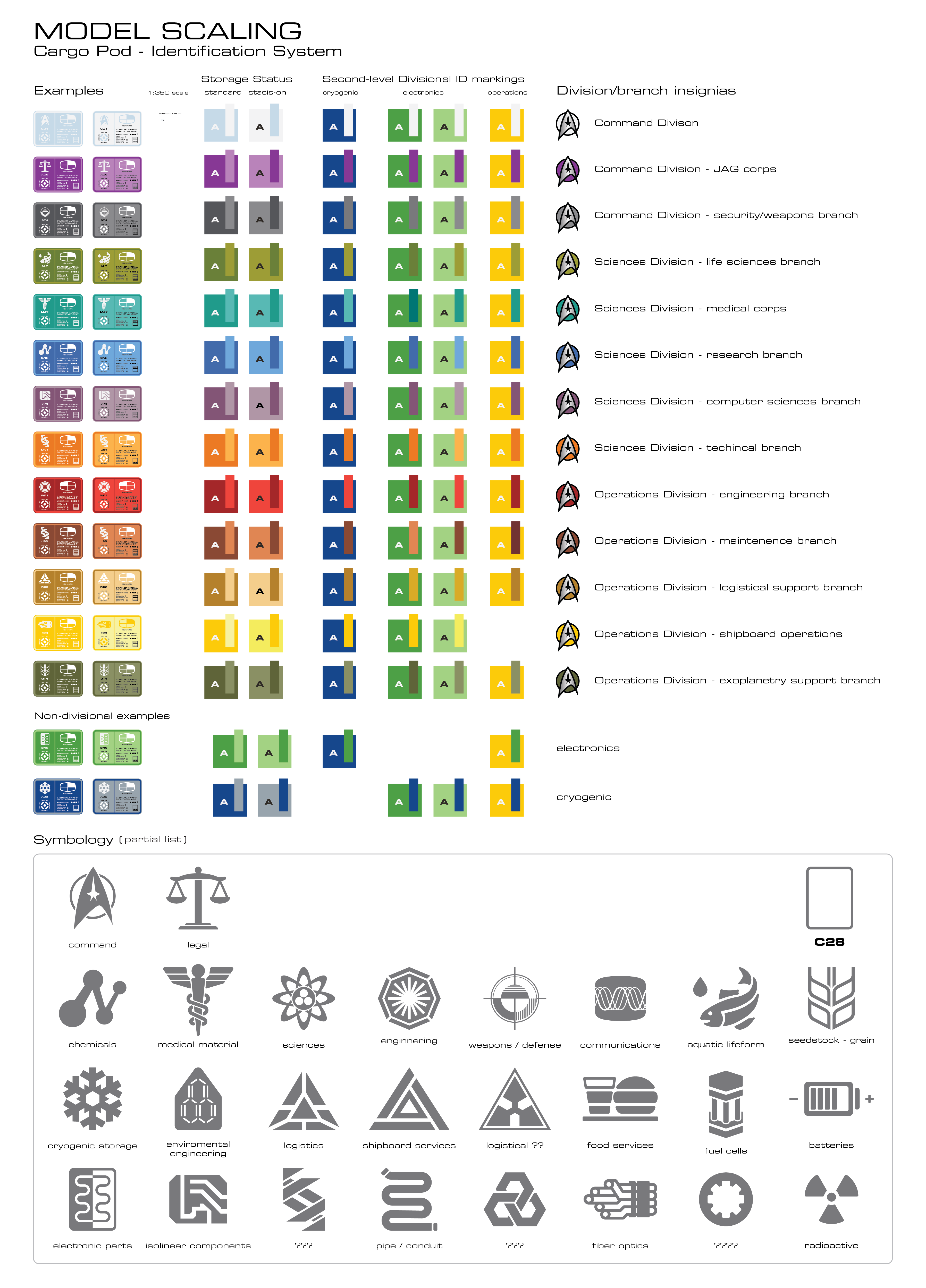
Cargo pod identification system
graphics I have been making based on
Lee Cole’s designs.
In trying to come up with various colors, I wanted something that would be of course printable (as well as a paintable) but also made sense in the Star Trek “in-unverse” starfleet design rationale. While a lot of the time, particularly in movies and such, things are designed the way they are simply to try and look cool. But good design and good science-fiction should also have an internal logic and coherency.
Things in the real-world are invariably designed the way they are, and look the way they do, for reasons beyond simple aesthetics. They are by and large driven by utilitarian considerations, manufacturing processes and various form-factor reasons. Plus things are designed to work with other objects, spaces, etc. and are largely dictated by those other objects, their form-factors, etc.
For example, there are reasons why coat hangers are designed they way they are, why the closet rod for hanging them on is usually the size it is, why it is usually installed generally at a certain height, etc.
Usability and form-factor drive the bulk of this.
So taking this understanding of how industrial and graphic design connect I began applying it to the fictional Star Trek universe. Specifically the cargo pods, their frames in the cargo hold, the labels on them, the colors of the labels, the design of the graphics… they should all be driven by these “in-universe” reasons and “make sense” within that universe.
Cargo pod blueprints in process.
I went and looked at the whole aesthetic of the Star Trek universe as shown in the Star Trek: The Motion Picture. From the corridor archway frames, which were recycled and used again on the television series Star Trek: The Next Generation (and where I got a lot of the actual set-diminesions which fans had unearthed and culled over the years)… to the color system the costume designers came up with for the insignias worn on the uniforms, it should all ideally “make sense” if you put enough thought into it.
So I worked out an imagined color-coding for the cargo labels which would integrate with the different starfleet departmental or divisional colors shown in the uniform insignias, as well as the graphics used on the ship, etc.
Likewise getting the cargo frames to “work” from the utilitarian logical sense of asking the question “why would engineers and designers in the 23rd century design things to look the way they do”?
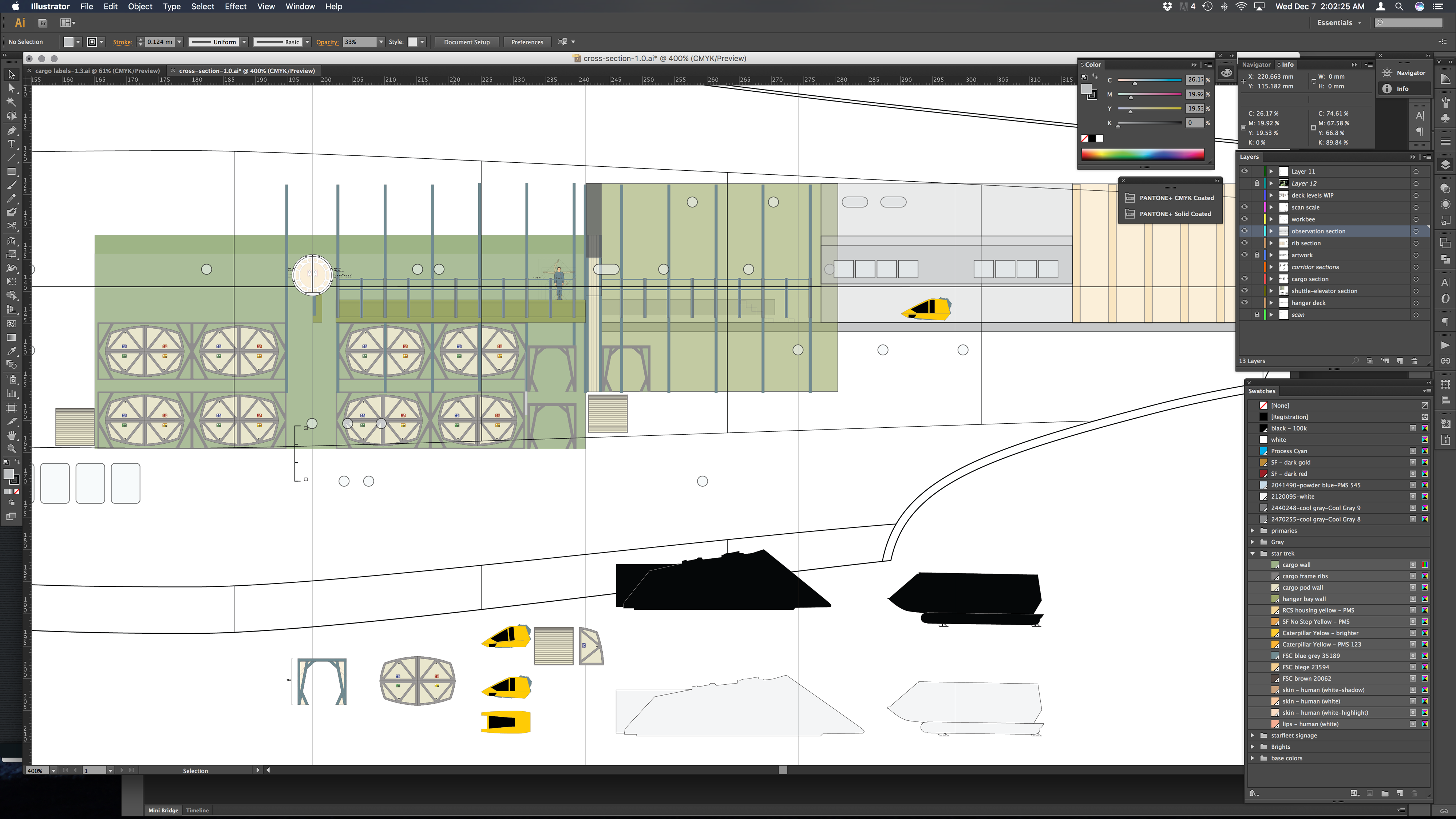
Enterprise cargo section and shuttle bay cross section illustration work-in-progress.
So I have been doing some deep-in-the-weeds work and re-working various seemingly disparate components and niggly details, which would all actually impact each other.
Working out why the cargo pods are “this size” because they would need to fit within the cargo frames, which would logically need to fit within the hull framing and ribs (which are shown in the cargo bay) that in turn need to fit within the Enterprise model itself.
The reason they have a corrugated curved surface should have a design and form-factor justification. The labels would need to make sense from a cargo management perspective and work within the symbology in use elsewhere on the ship and in starfleet as well as be good design from a aesthetics perspective. All this would need to have a solid and usability rationale as well as elegant design. Hence my taking it to another level. Not just in the “how would this work in the here and now in the 21st century?” sense, but also “where would things be in a nearly 300 years in the future?” sense as well.
I figure they would not be using actual stickers in cargo management. Not just within a single starship, but for a starfleet, the dry dock facility, and the implied logistical infrastructure that would need to be there to justify the cargo pods, etc. While the Enterprise is built to operate in the vacuum of space, its design and everything in it should not be designed in a vacuum.
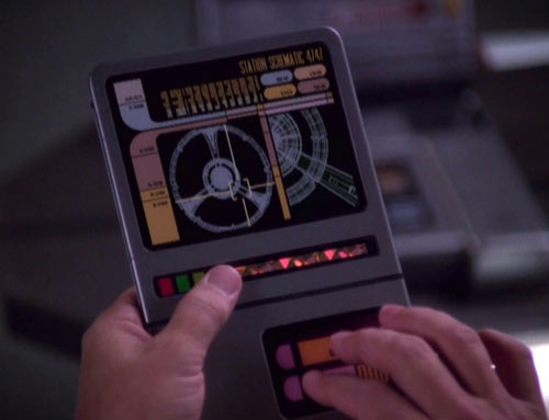
Example of a PADD from Star Trek: Deep Space Nine.
Reasonable conjecture might envision the development and use of super energy-efficient “smart paper” touch surfaces (think 23rd century iPads, which BTW people at Apple freely admit they were inspired by the Star Trek Personal Access Display Devices (PADDs) shown even back in the original Star Trek series to invent the iPhone and iPad). This “smart paper” would be able to stay active for years without recharge and could have nano-scale light recharging properties built into it. This would enable them to “stay on” and be powered pretty much indefinitely. Any exposure to a light source would begin recharging it and it would become active again even if it had been held in a dark environment for years.
I further imagine that these “smart paper” touchscreen labels would include a form of RFID tracking system functionality built into in them. As well as a be a controller interface for the integrated anti-gravity system built into the cargo pods as shown being floated in the cargo bay by a couple of deck-hands.
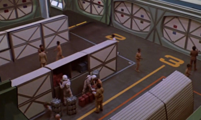
Open cargo pod from a shot in StarTrek: The Motion Picture.
One of the cargo pods is also shown open sitting on the cargo deck, showing the dual compartment aspect of the top half of the cargo pods. There are stowed items and gear being taken out of that cargo pod.
So working backwards, how do we reconcile the way those cargo pod doors open with the physics that would be demanded of these cargo pods?
They would need to have thermal protection from extreme temperatures in space, protection from expected solar electromagnetic radiation. They would need to be pressurized for items that can’t handle the vacuum of space, they would have to protect items within it from damage due to banging around inside while in a zero-g environment, and on and on.
So I rationalized that the curved corrugated back walls of the cargo pods serve multiple purposes. Aside from the corrugation giving high-rigidity to the frame, which is why everything from cardboard box walls to intermodal shipping containers are corrugated, if the folds of the corrugation surface have a interior channel angle to them, they could serve as a method of securing items with straps.
This system of “hook-in” straps and netting would be similar to the wall systems in a lot of retail stores which have slatted wall panels that allow shelving arms and display fixtures to be “hooked” into the slats of the wall panel.
This makes those corrugated slats “make” sense if you have a standardized system of clip-in straps, cargo netting, etc.
The “smart paper” label would, like an iPad, be interactive and help in cargo management as well as controlling the cargo pod itself.

Cargo pod “smart paper” display graphic. Can you spot the Easter Egg to a classic Star Trek episode in this?
This would make it so that the cargo manifests could be displayed, edited and be changed by the people moving the cargo pods around as well as be modified remotely. The background coloring and iconography would change depending on what is in the cargo pod. Likewise where its location within the cargo hold would change as it is moved around. Sort of a cargo pod mini GPS tracking system. Like large warehousing and package management systems in the here-and-now, it would have RFID local area communications so electronic records and manifest systems could instantly locate where in the cargo hold an item is, what cargo pod an item is stored in, its disposition and status, etc.
Detail of a screenshot showing a cargo pod being
“floated” by its integrated anti-grav system.
The “smart paper” touch surface could also be, again like an iPad user interface, interactive and control the anti-gravity system built into the cargo pod itself. The thinking would be you could unclip the “smart paper” PADD from the within the integrated alcove on the cargo pod surface it would be mounted into, and then remotely “float” the cargo pod around using the “wi-fi”-type connected user interface to maneuver it to where you need it to go.
This would include moving it into the corridors of the ship itself. Which leads to another retcon design rationalization as to why are the cargo pods the shaped the way they are.
That cross-section of having one of the sides of the pod curved always made me wonder “why that shape?”

Typical airline cargo container being loaded with boxes.
Well at first I assumed it would because they were like the luggage/cargo containers used on airliners today. Containers which need to use as much of the available space within the curved underside of the aircrafts fuselage as possible. That certainly is possible as to why the set designers at Paramount came up with that odd shape. Taking a design cue and “smoothing it out” into elegant curves instead of the blunt angle facets and chamfers of the airliner cargo containers.
But I then noticed the ubiquitous pressure doors and faceted “curved” walls in the corridors of the Enterprise sets, which even carry through from the movies to the Star Trek: The Next Generation series. These are roughly elongated partial octagons in shape.
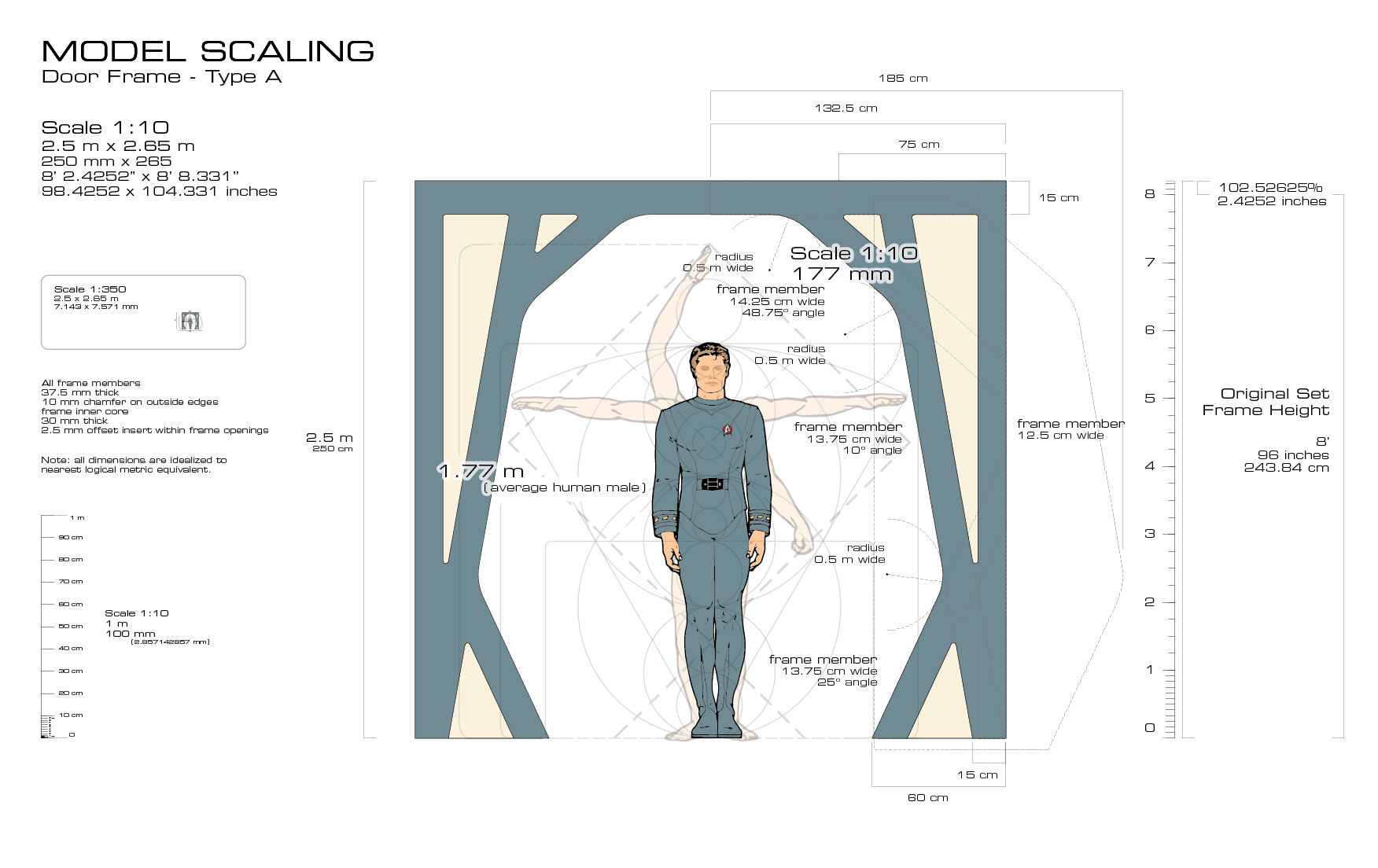
Type A door frame blueprints, reversed engineered
from the original set dimensions.
I then took the derived cargo pods elevation drawings, and matched them up the drawings I reworked (to their nearest logical metric equivalent for the actual set dimensions) of the corridor section and doorway arches.
Eureka!
Those shapes roughly match.
So those sloping cargo pod outer walls would allow the cargo pods to be “floated” through the doorways and through the shipboard corridors. Not only that, but since they float via their integrated antigravity systems, you could rotate them in the air within a corridor section.
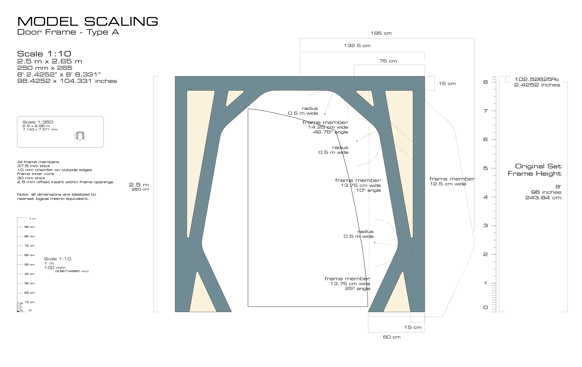
Type A door frame with cargo pod outline.
In a corridor intersection you could turn them around laterally as well. Furthermore, you could “land” them upright (like in shown in the cargo bay deck shots) within a corridor and if moved against the “curved” corridor wall, the flat vertical surface would be about midway in the corridor’s floor which would still afford enough clearance that a person could walk past a “parked” cargo pod in a passageway. So you would not create a hazard by clogging up a passageway with a cargo pod parked onto deck to be unloaded/loaded or stored.
So, all this to say that I spent a lot of time during the evenings after work this past week and half doing some uber-nerd contemplation. Drawing and redrawing and trying to harmonize all the various design elements within the movie and the Star Trek universe to make them “work” and have a logical sense to them.
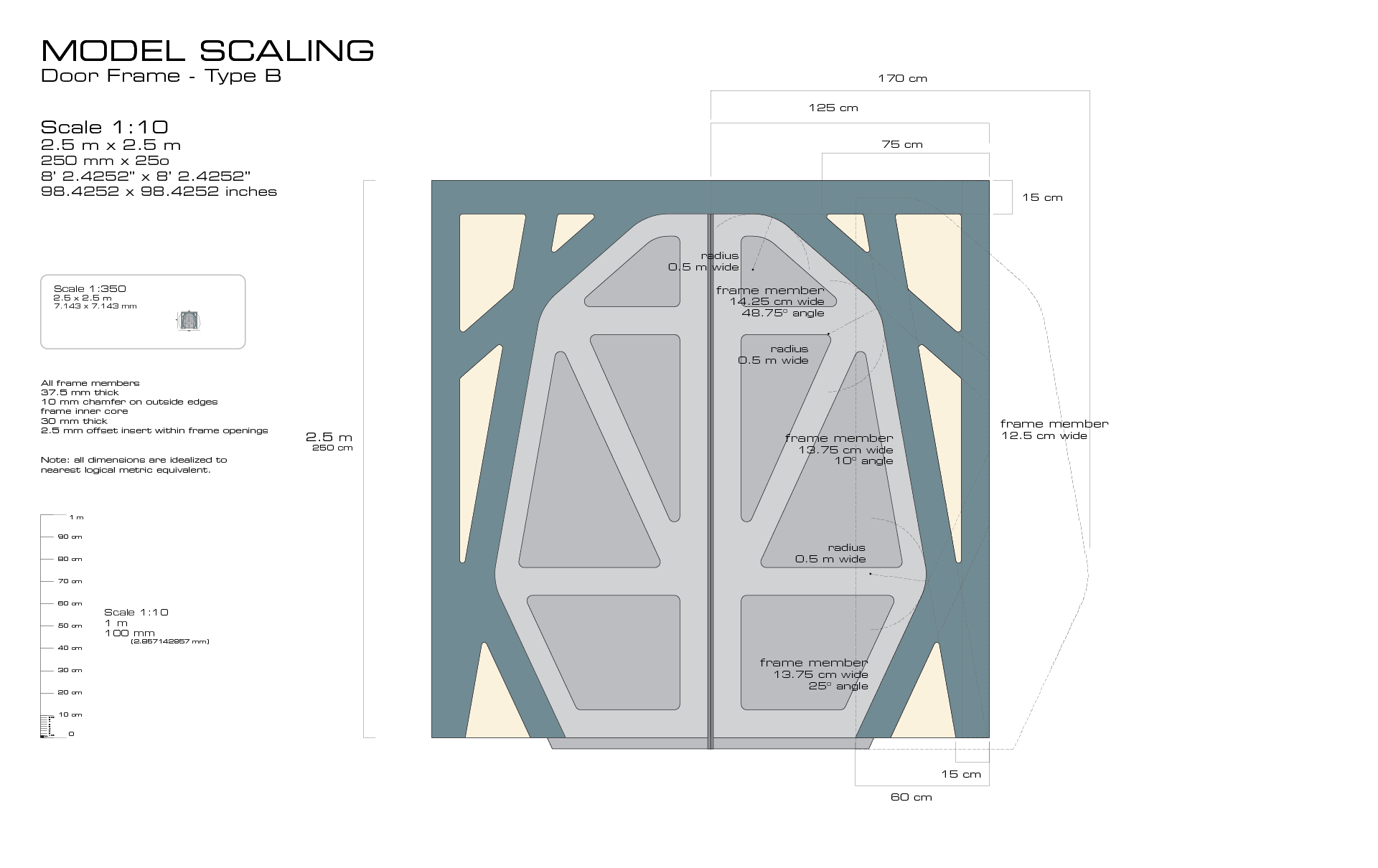
Type B door, which is the narrowest starship corridor doorway from the movie and television series sets.
Now while these cargo labels at 1:350 scale are little more than little microscopic colored rounded rectangles, down the road if I end up scratch building a larger workbee, it will pay off.
In addition, working out a harmonized set of dimensions and proportions will aid in making the scratch-built cargo bay parts of the model. And who knows where else and who might benefit from having these design assets once I finish it all?
I do intend to make them available to other modelers and Trekkers once I get this all done (in a few years at this rate).
But there is a reason they call this stuff a hobby. I do enjoy noodling on this kind of thing. Thinking through, and tinkering with, all this 23rd century nerd stuff.

Pingback: Engineering a Spine | Third Wave Design
Pingback: Uniform Seating | Third Wave Design